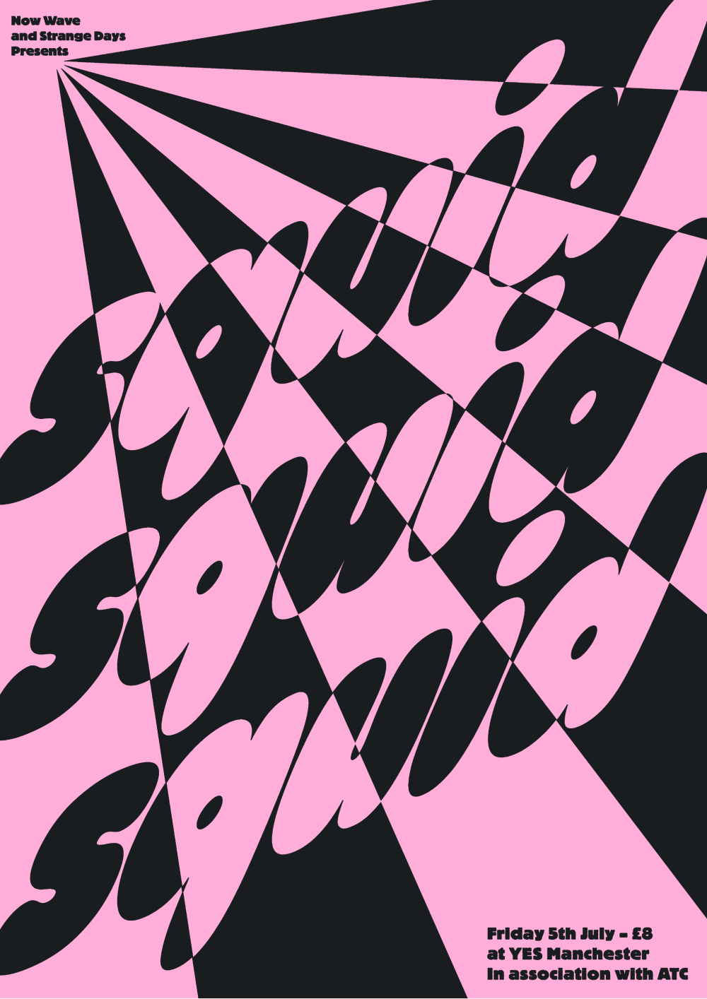
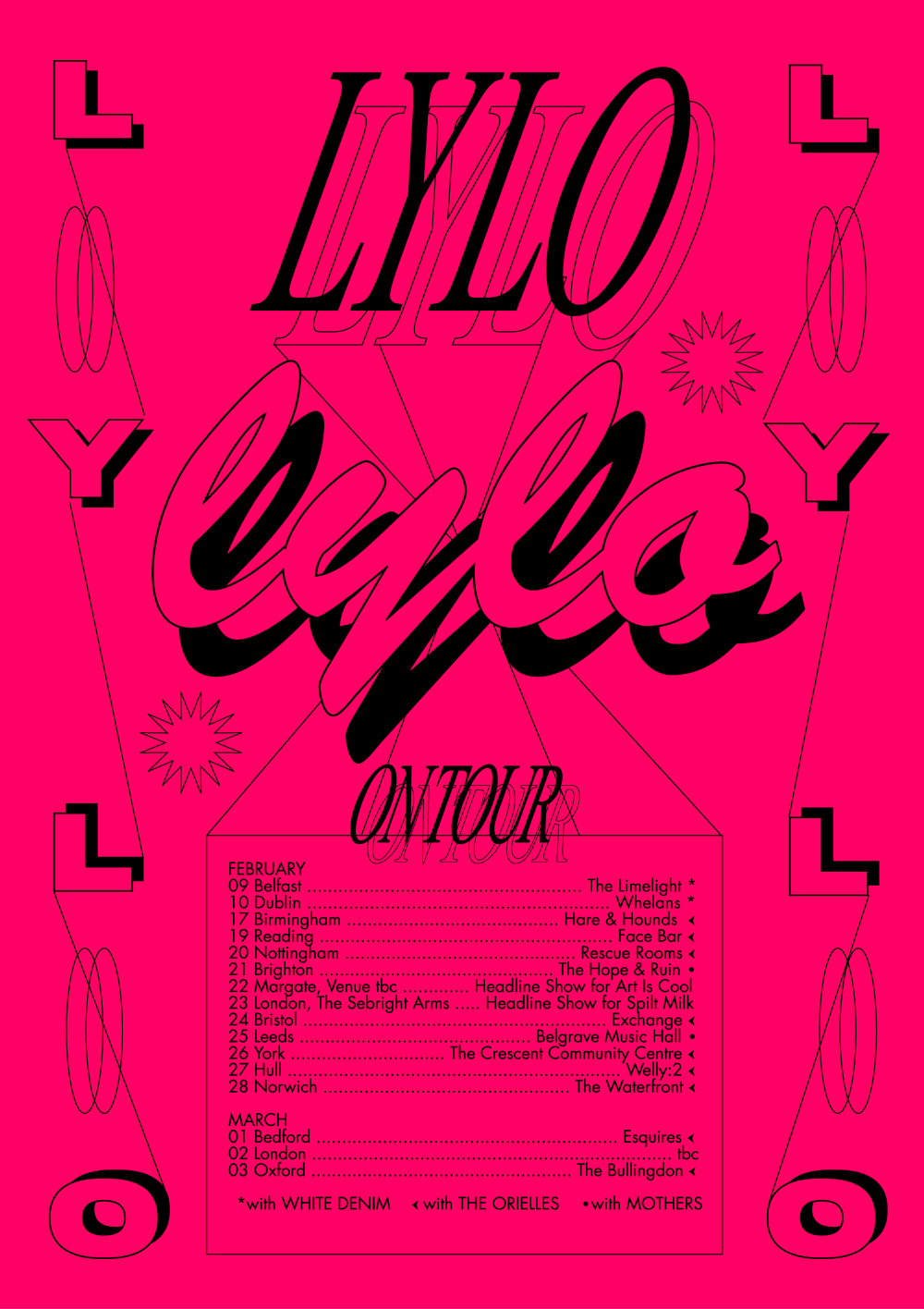
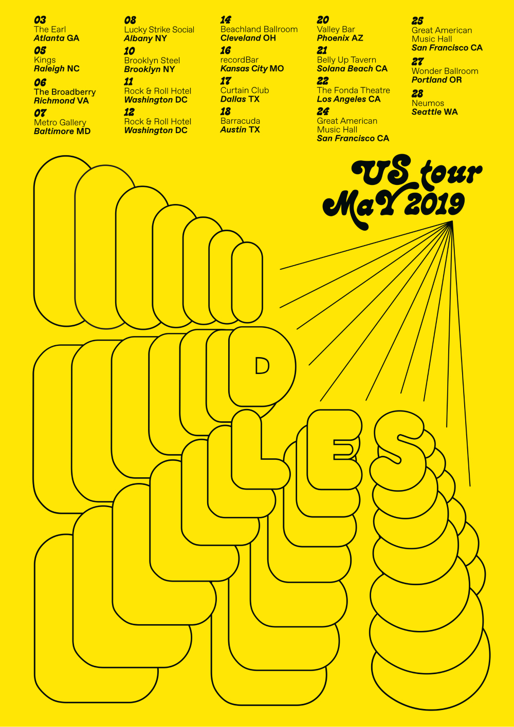
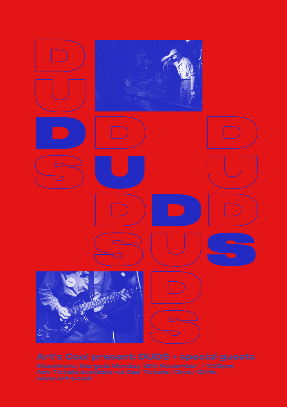
Portfolio in progress :)
MTV
NIKE

THE ROLLING STONES
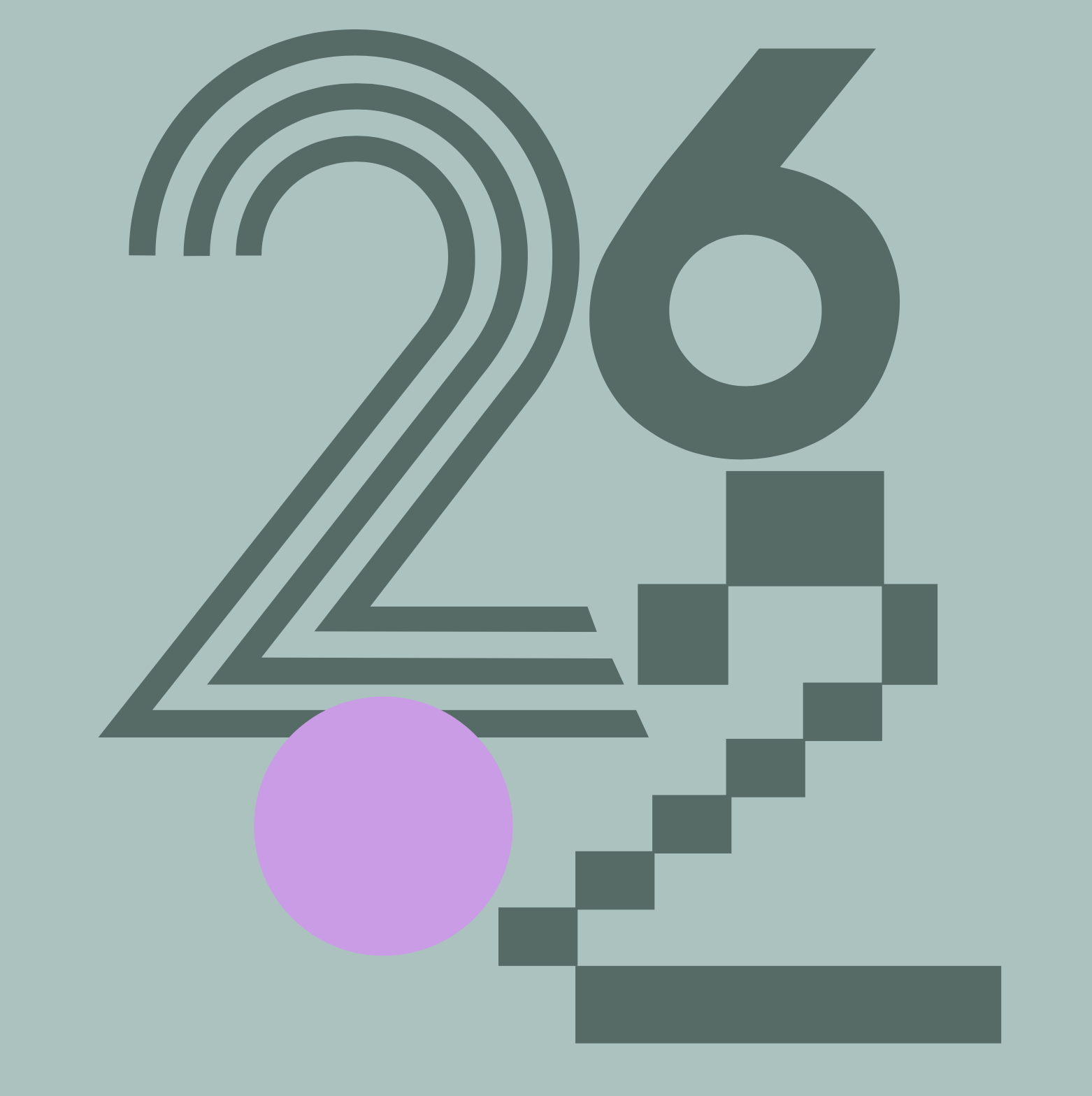
2024

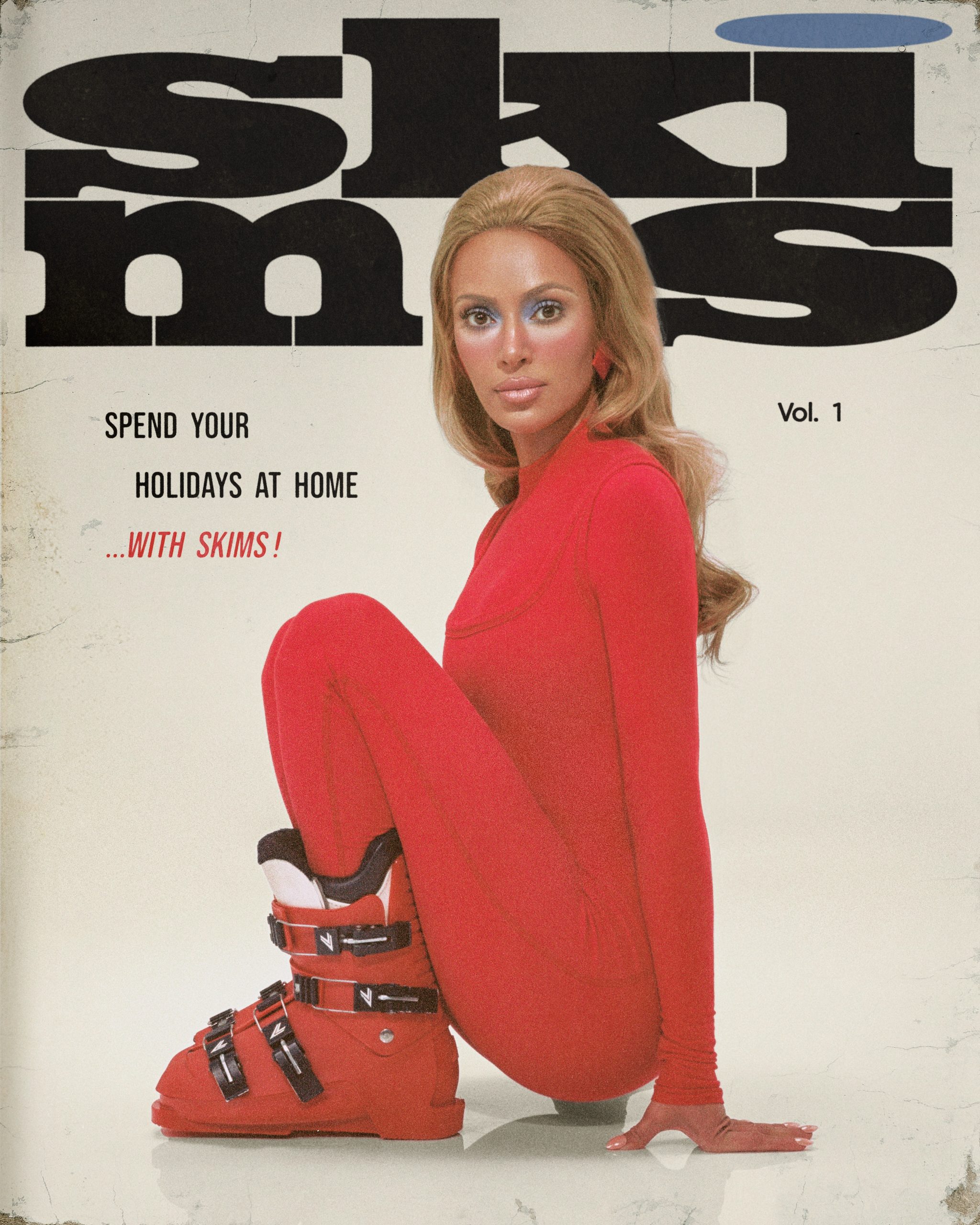
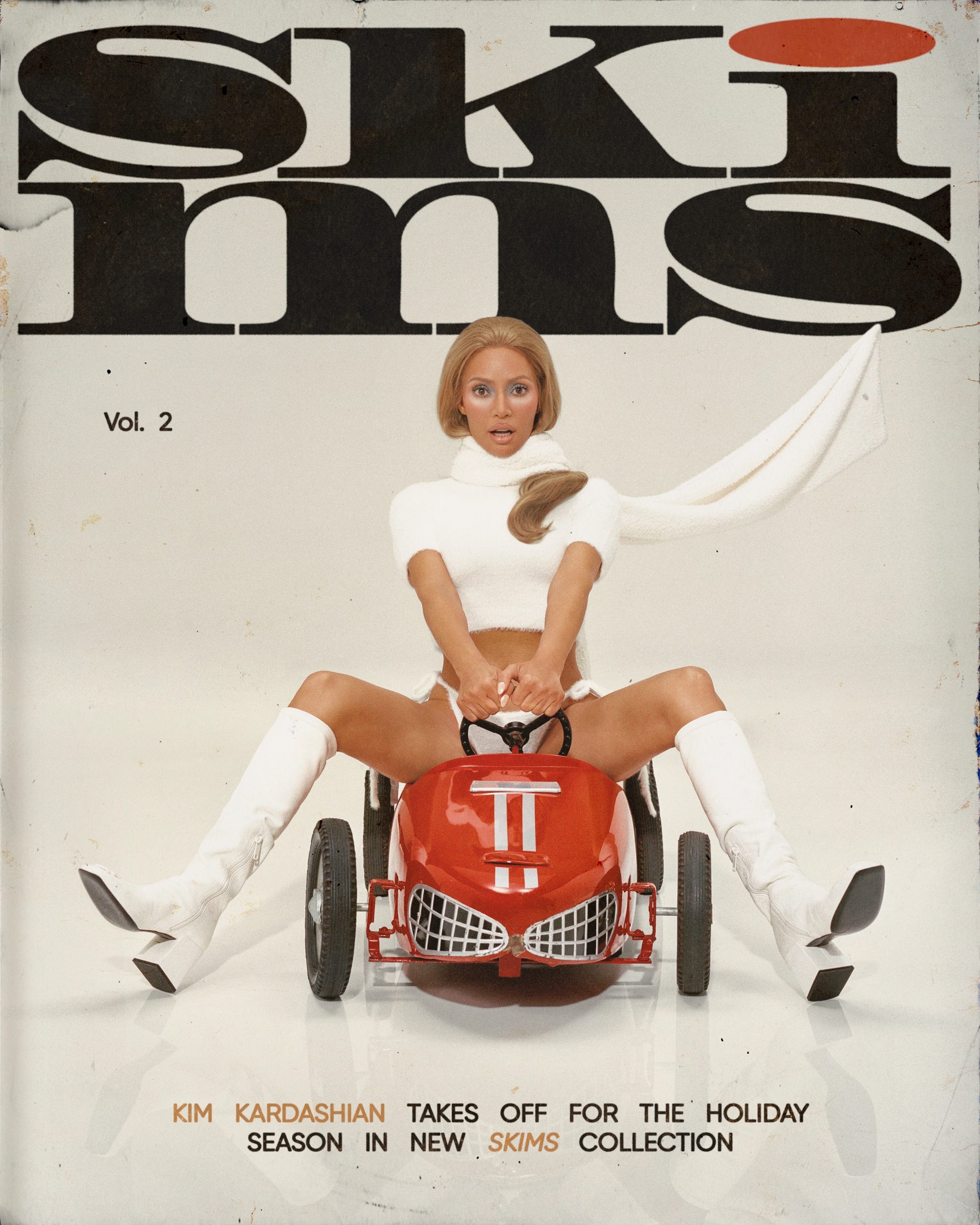
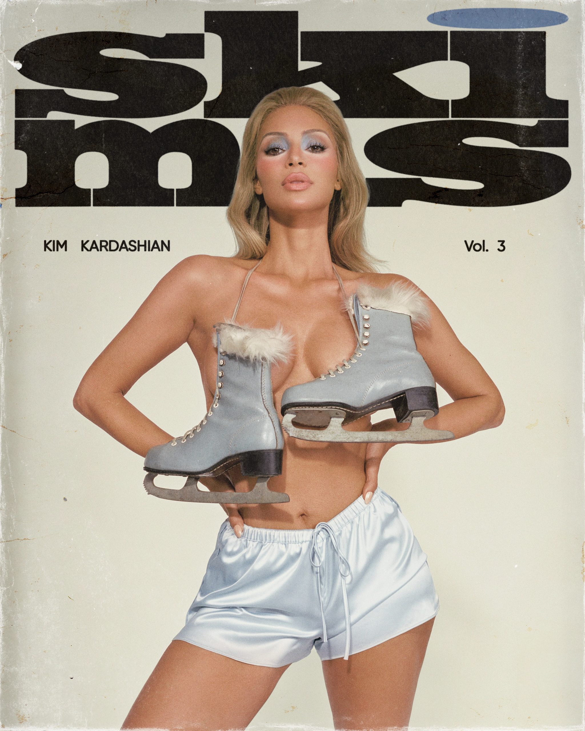
SKIMS

Reebok
NYTIMES
DAZED X GUCCI X ARLO PARKS

TRIBUNE
2024
FT WEEKEND
2023
MANESKIN
Pull & Bear shops
2023
V&A poster acquisition

MONOTYPE
2024
THE STANDARD HOTEL
2022
LAZY OAF
2022
NADIA LEE COHEN "WOMEN"
CAM SUGAR US BILLBOARDS
BLUR at WEMBLEY
WETRANSFER / WEPRESENT
SARAH BAHBAH "DEAR LOVE"
RAISSA PARDINI X SMILEY X MUSIC DECLARES
2023
EARTH PERCENT
2023
NEIGHBOURHOOD BOTANICALS
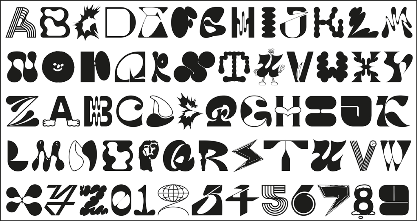
Group Font
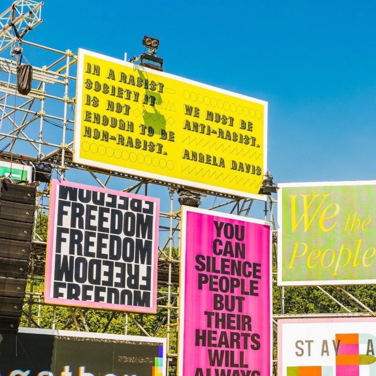
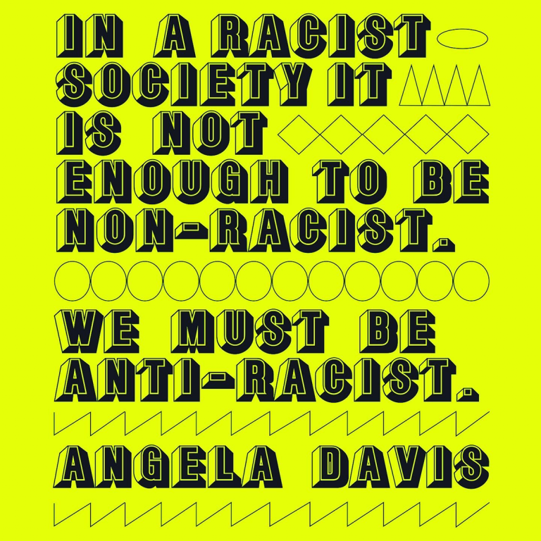
GLASTONBURY BILLBOARDS
My Type Of Revolution
2022
VILLAGE UNDERGROUND
2022
Inspiration Information, Ibiza
2022
MOOOOORE DESIGN!
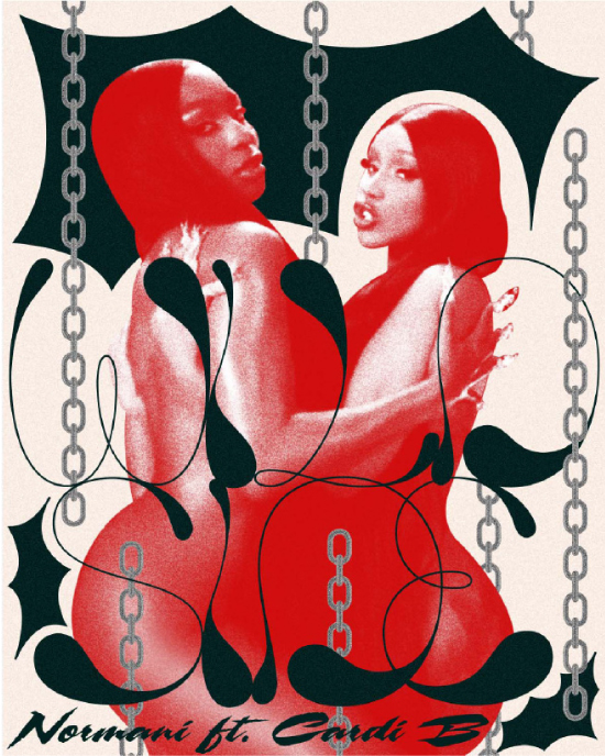
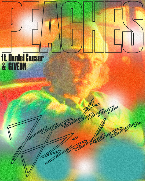
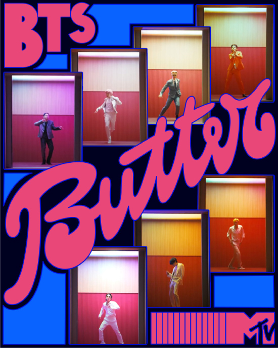
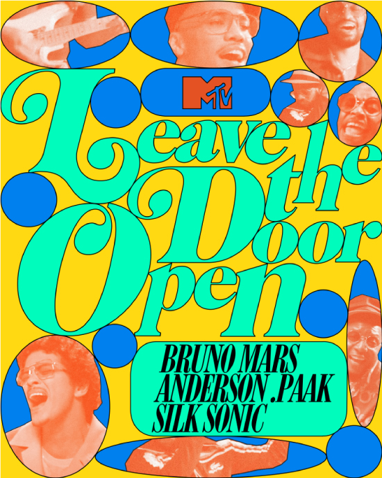
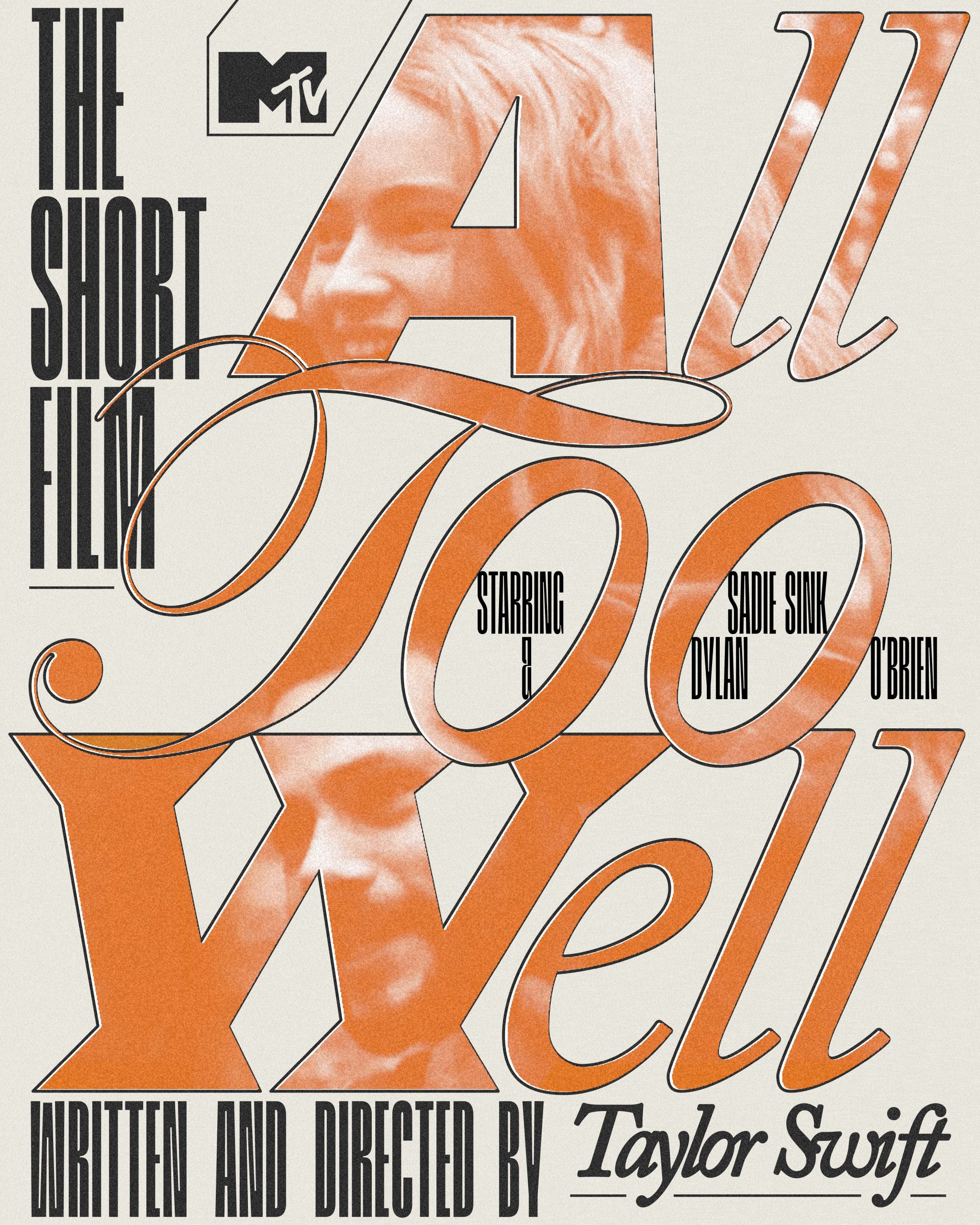
MTV
MTV Best of 2021 videos of the year
MTV USA was looking to commission some custom digital pieces MTV’s social media pages. They were dedicating the whole month of December to popular music videos in 2021 through commissioning lots of artists different assets to create.
These pieces were created in the form of old movie posters. Each one would highlight an illustrated scene from a music video, as well as the artist’s name, song title, and featured artists if applicable.
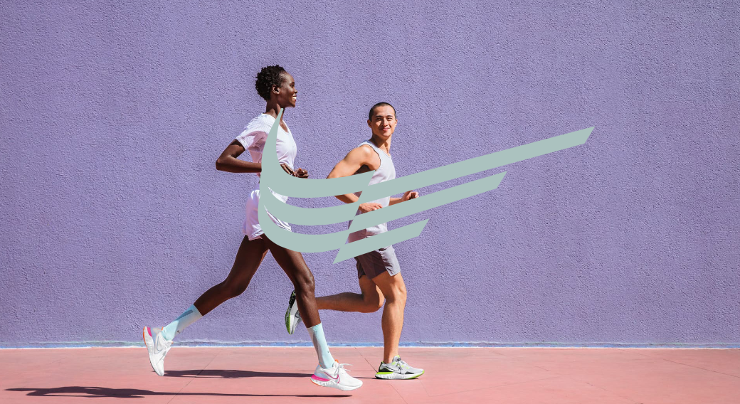
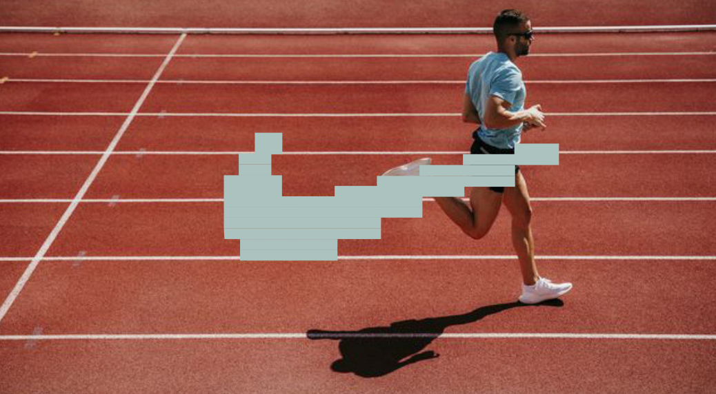
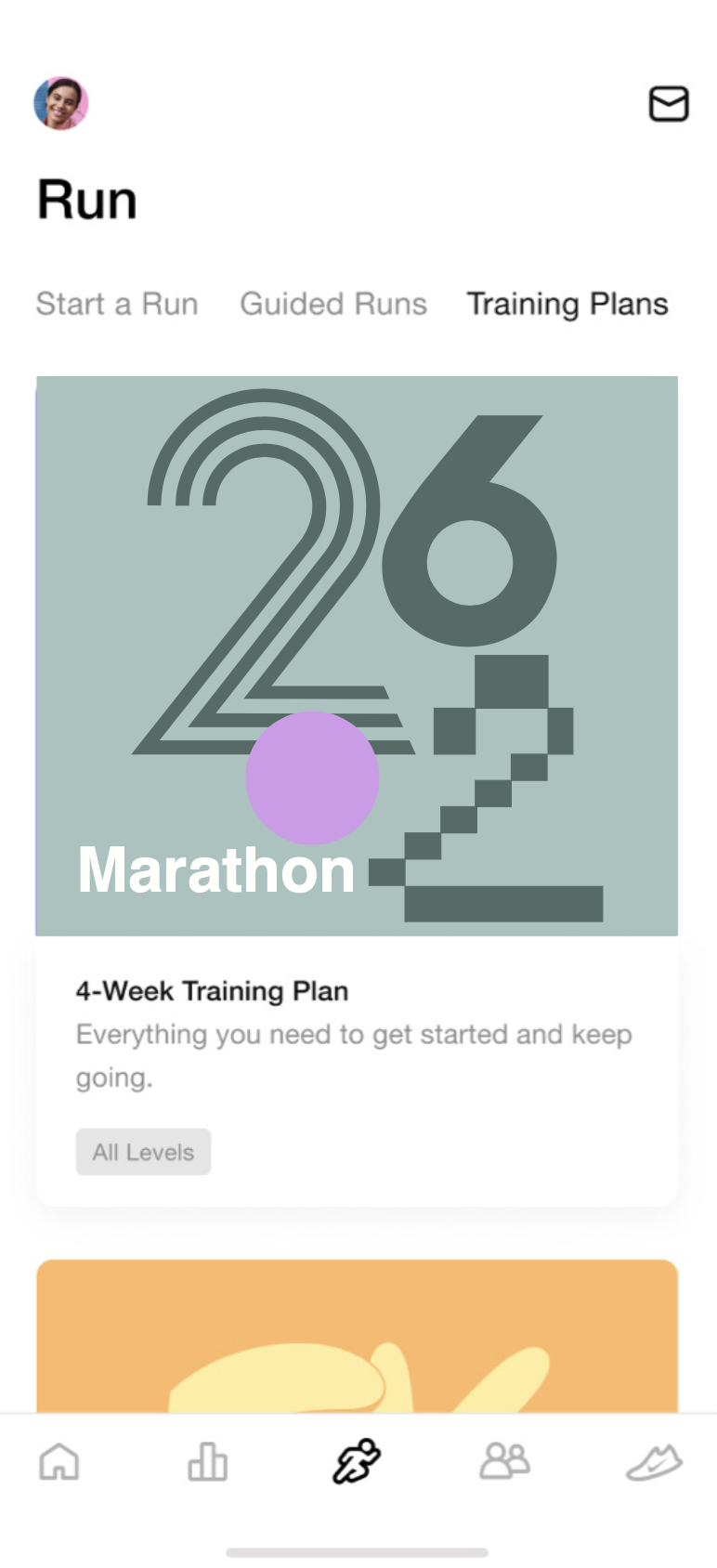
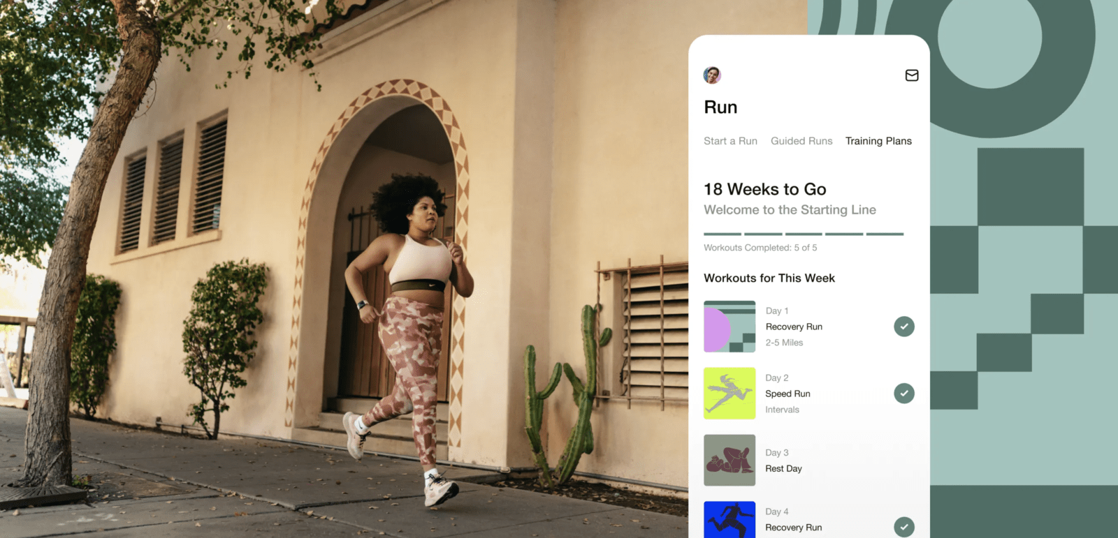
NIKE
NIKE RUN APP. MARATHON CAMPAIGN, 2022
A 18-weeks Marathon training. 18 weeks of challenges, assets, motivational graphics, incredible videos from their talented in-house coaching and art team. What a wonderful project. We worked really hard on projecting the sense of running and assisting anyone on their run. Steps, breathing in and out, running tracks. Running anywhere at anytime.
THE ROLLING STONES
Raissa: "The Rolling Stones contacted me back when I was in India working on a massive facade and I truly had to juggle things around to make this happen but who wouldn’t have done for the Rolling Stones?!
For Glendale, I got asked to feature the city in the mouth logo! Here’s the Arizona desert, the city skyline and its famous hot air balloons. It’s also “the valley of sunshine” hence the rays of light."

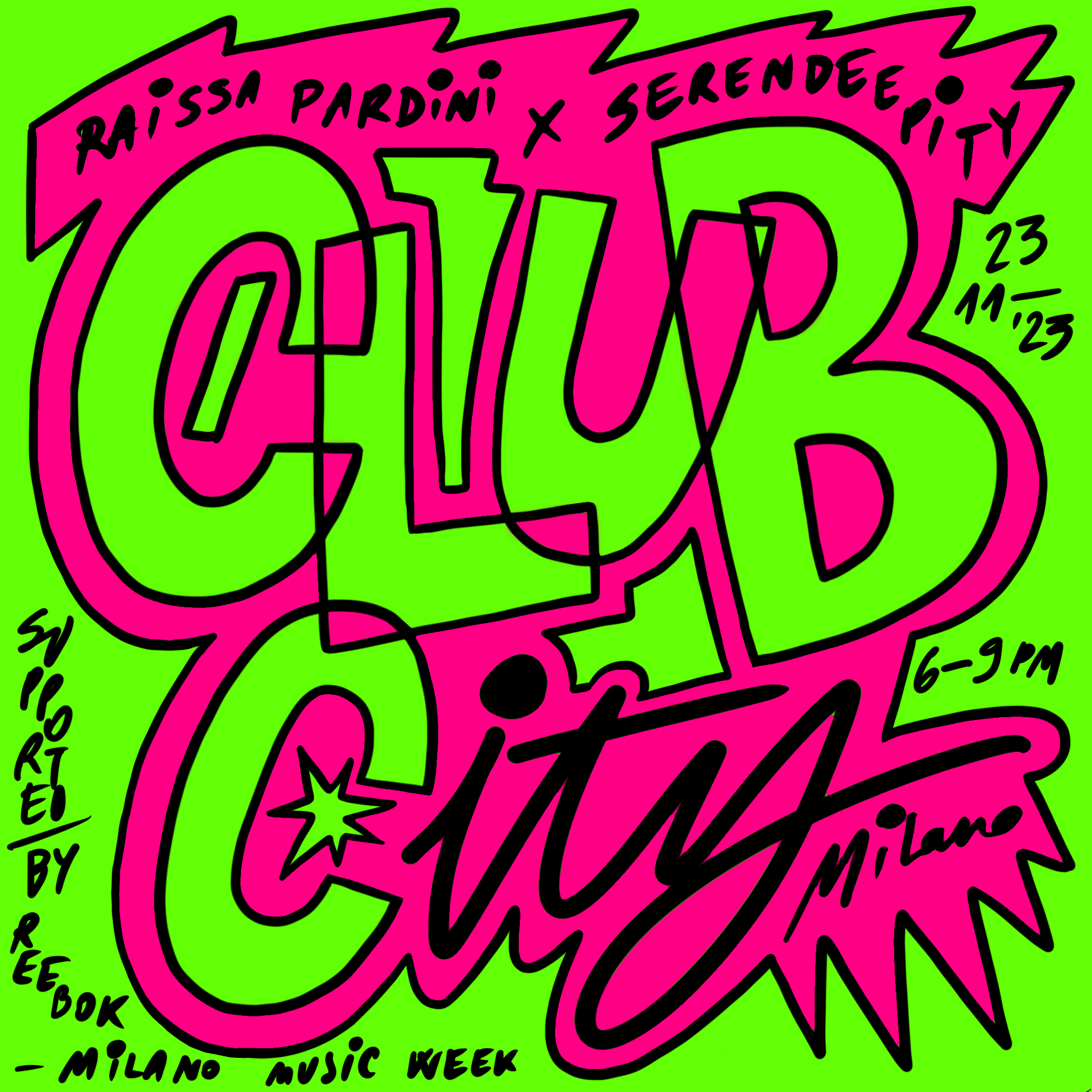
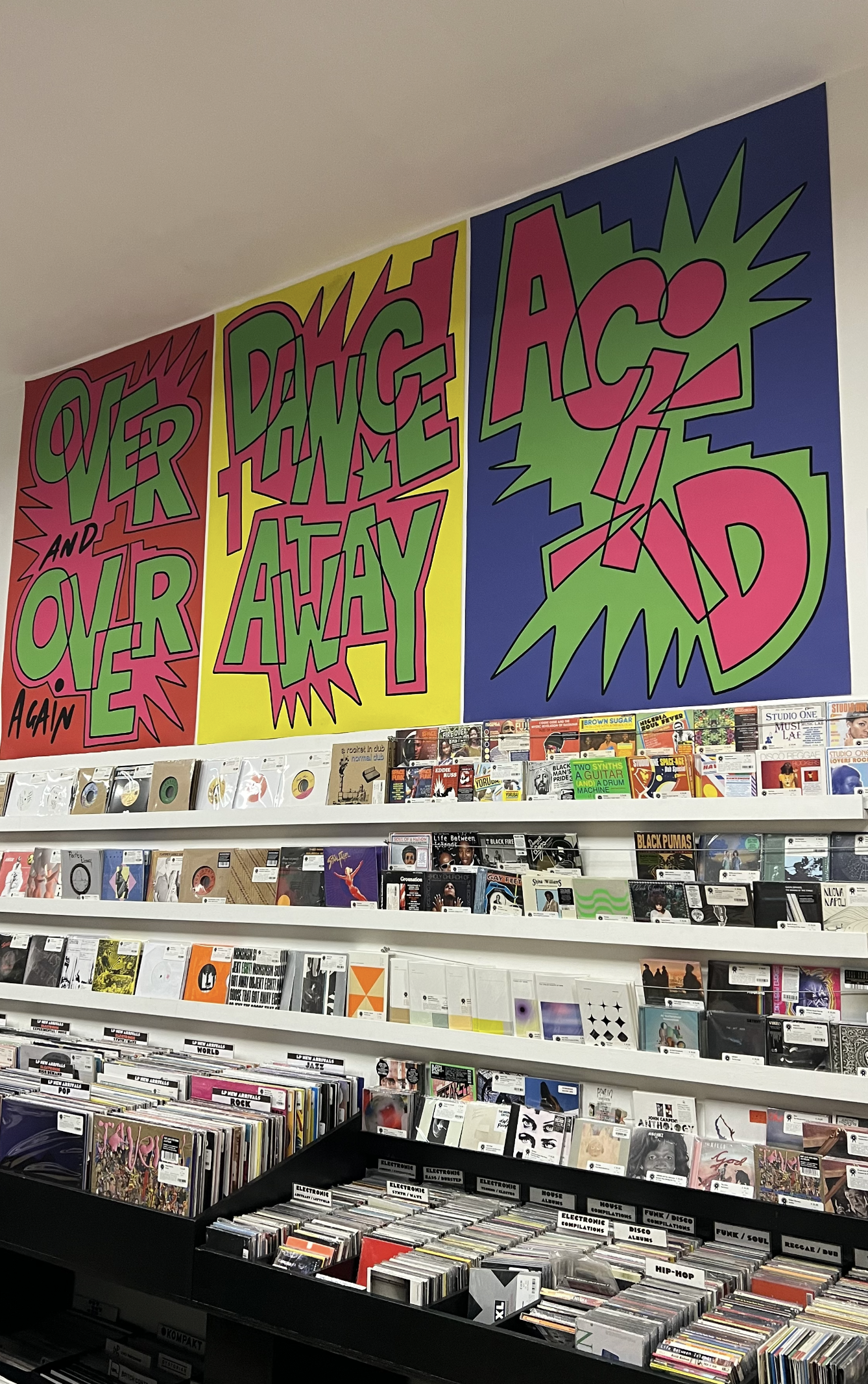
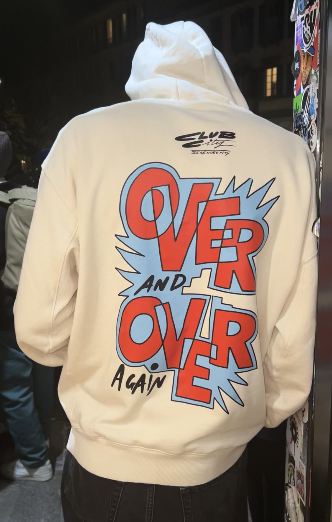
Reebok
Reebok Europe invited Raissa to design a series of assets to celebrate their iconic Club C85 and so its huge influence to music subcultures.
Feeling at home in record shops, setting the scene at Serendeepity in Milan was very iconic.
We printed tees, sweaters, posters - we listened to music and we danced away. More pics to come!
Special thanks to Nicola Mazzetti, Milano Music Week and Aaiinntt Studio .
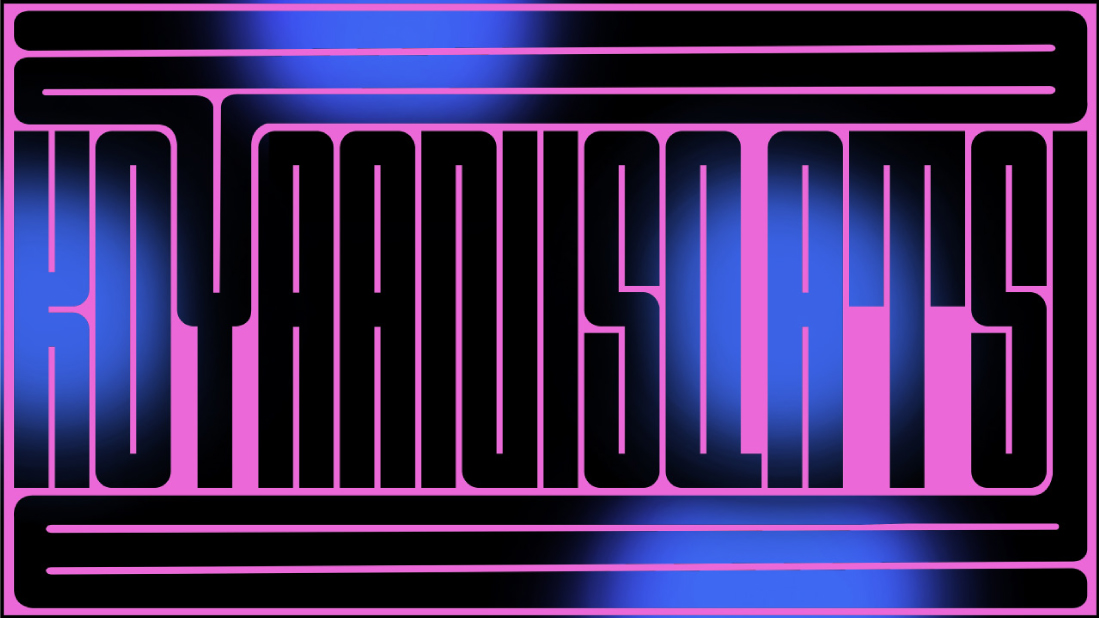
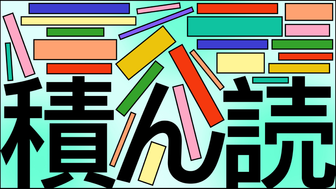
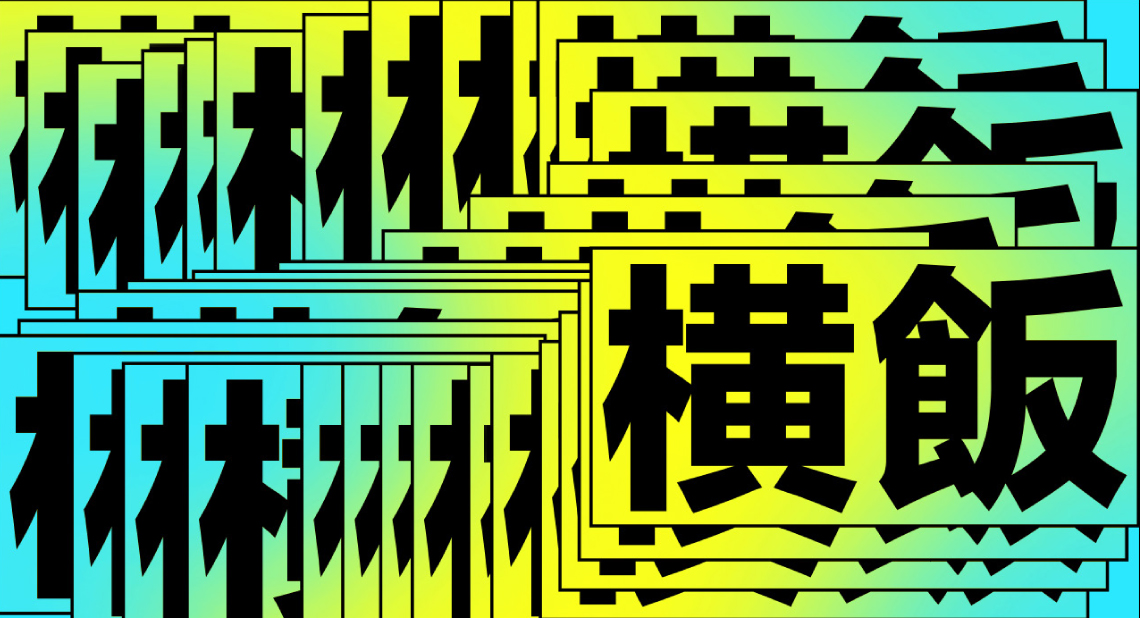
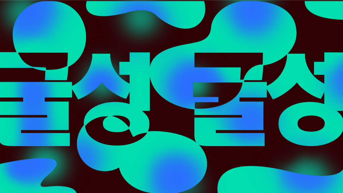
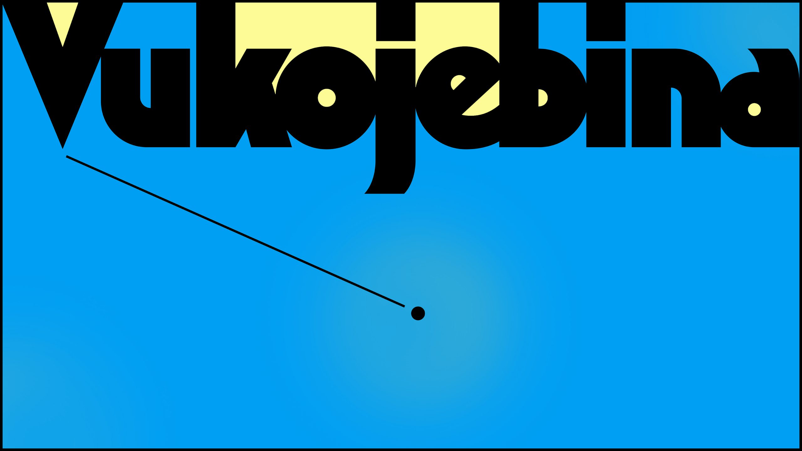
NYTIMES
NYTIME X T BRAND X DEPARTURES, 2021
NYTimes and its T Brand commissioned a series of 35 artworks for a column called “Beyond Words”.
This is a series featured a different word along with a visual. We had the challenge to create illustrations just with letters and typography. The most exciting part of the work was designing with foreigner alphabets and sets of letter.
All 35 words were very unusual ones from all around the world. They cant be fount in the vocabolary as they were “undefinables”.
A few meanings of the words we selected here:
Koyaanisqatsi (Native American Hopi): Nature out of balance” or a “way of life that is so crazy it calls for a new way of living”.
Tsundoku (Japanese): The act of acquiring so many books that they pile up unread.
Rame (Balinese): Something that is at once chaotic and joyful.
Yoko meshi (横飯) (Japanese): Literally ‘a meal eaten sideways’, used to convey the peculiar stress induced while speaking a foreign language.
Gulseong-gulseong (Korean): Eyes filled with tears, which are about to fall but have not yet run out of the eyes.
Kilig (Tagalog): The giddy excitement you feel when something romantic happens, either to you or someone else; the feeling of butterflies in your stomach when you catch your crush’s eye for the first time, witness a marriage proposal, or see your favorite TV show couple finally get together.
Shemomedjamo (Georgian): “I accidentally ate the whole thing”; when something’s so delicious, you eat it all before realizing.
Vukojebina (Serbian/Bosnian/Croatian): A place in the middle of nowhere
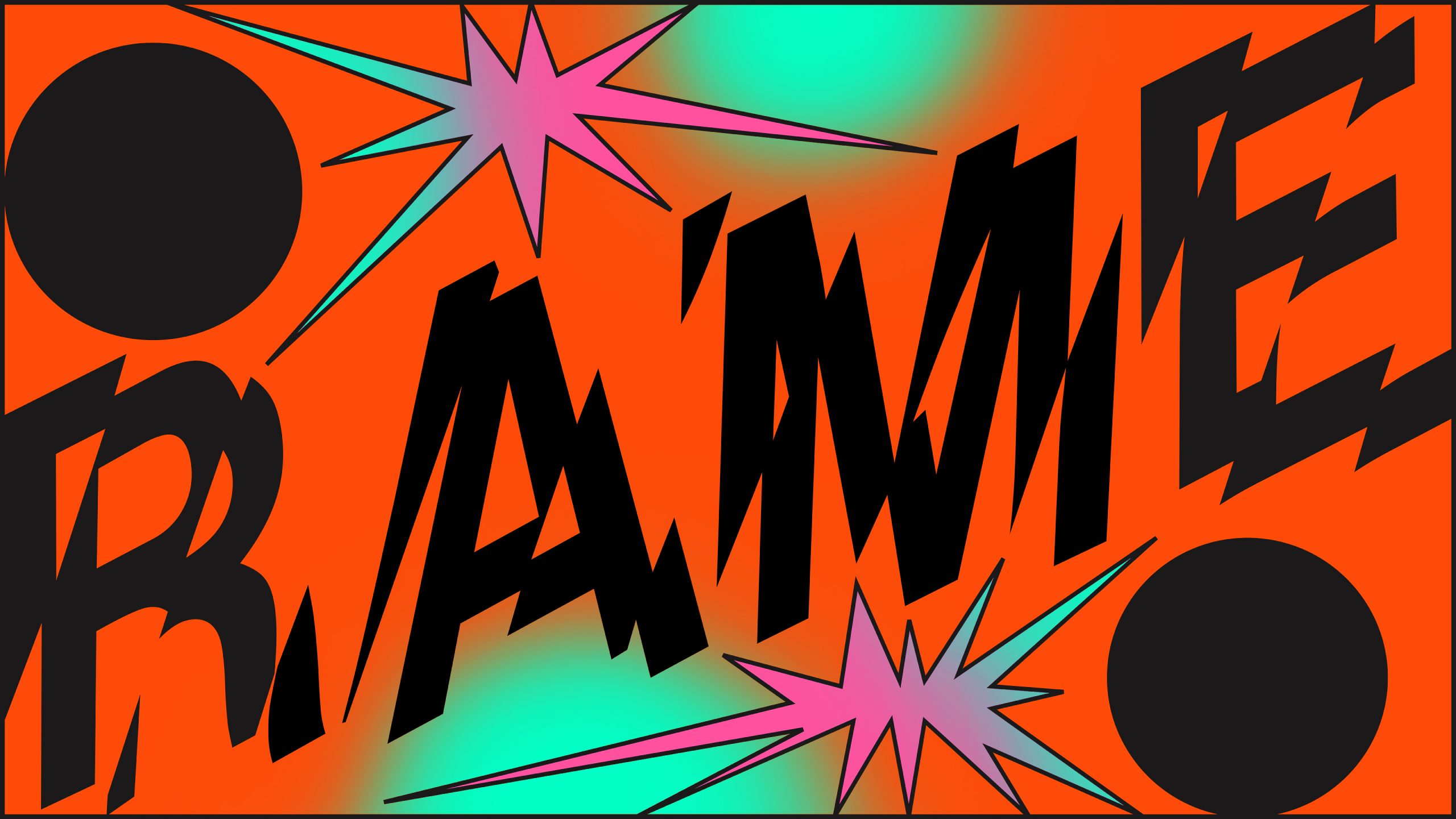

TRIBUNE
Raissa: "If you ever visited my home, you’d notice a neat stack of @tribuneuk magazines next to my sofa—a source of pride for me. I frequently delve into their articles, meticulously studying them and gaining fresh insights each time. The magazine is iconic, both for its content and its captivating covers, which have always been a standout feature. Designing one of those covers has long been a dream of mine, and being tasked with creating the cover for the special miners’ strike edition feels like a dream come true. It’s a piece that will hold a place of honor on my wall and in my heart. My heartfelt thanks go to Polina and Taj for this incredible opportunity.
If you haven’t already, I highly recommend subscribing. Not only will you enhance your own reading experience, but you’ll also be supporting what I consider to be one of the finest magazines around.
Since its establishment in 1937 as a response to the threat of fascism in Europe, Tribune has been a key player in left-wing politics in Britain for eighty years. Throughout its history, it has been a staunch advocate for socialist ideals, both within and beyond the realm of parliamentary politics. Relaunched in 2018 with the backing of Jacobin, Tribune is dedicated to upholding and rejuvenating the rich tradition of the British left."


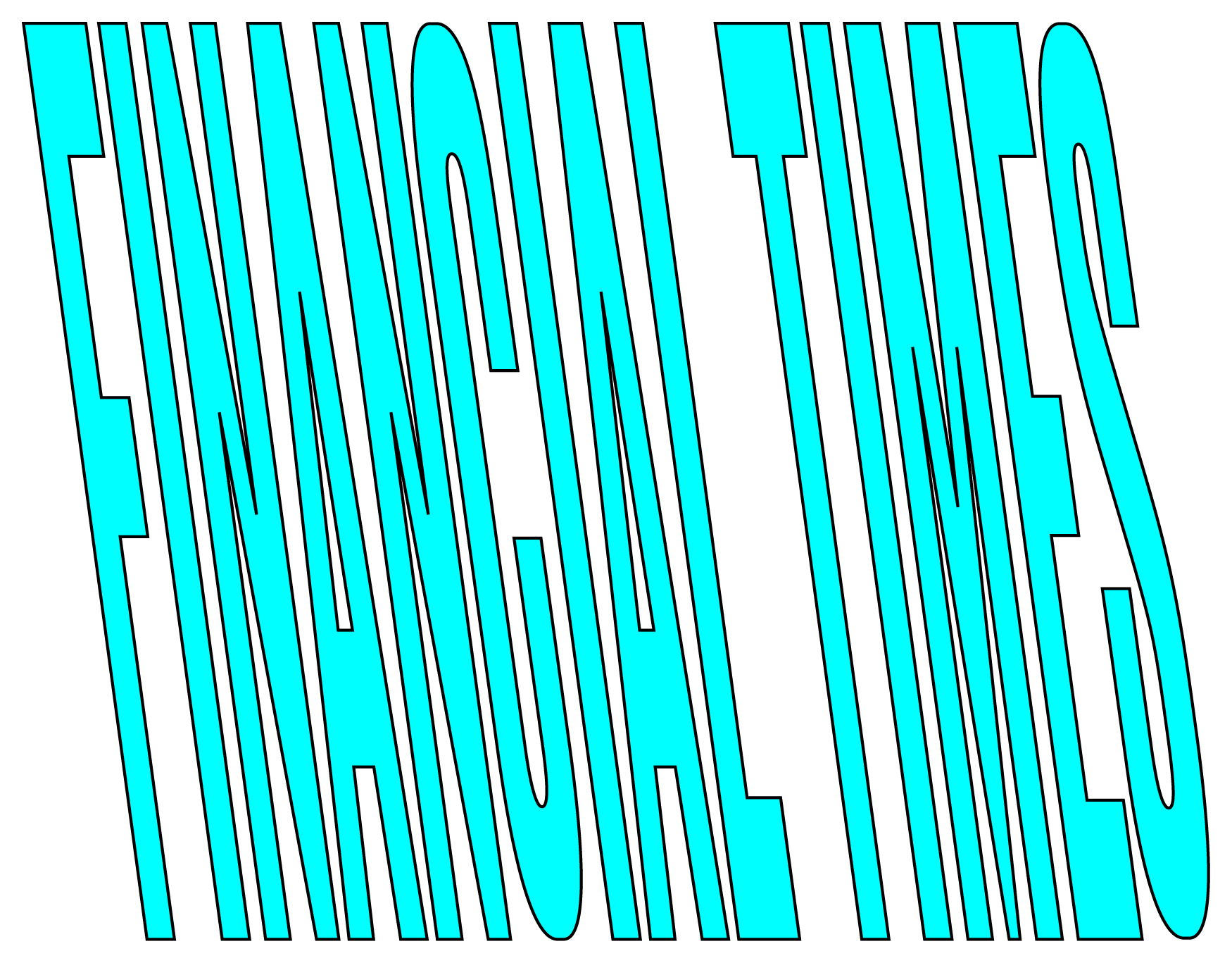
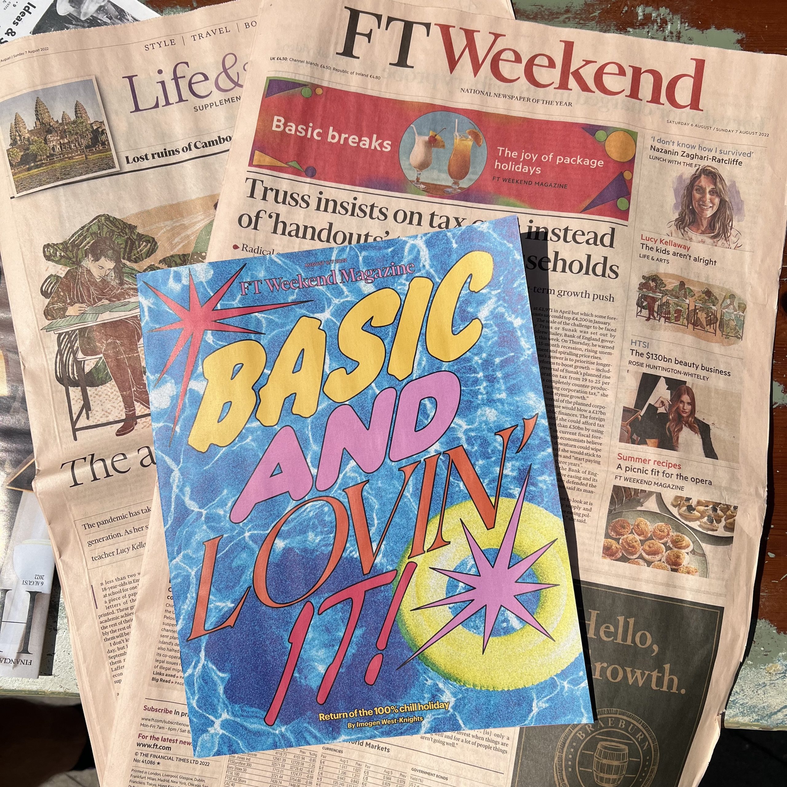
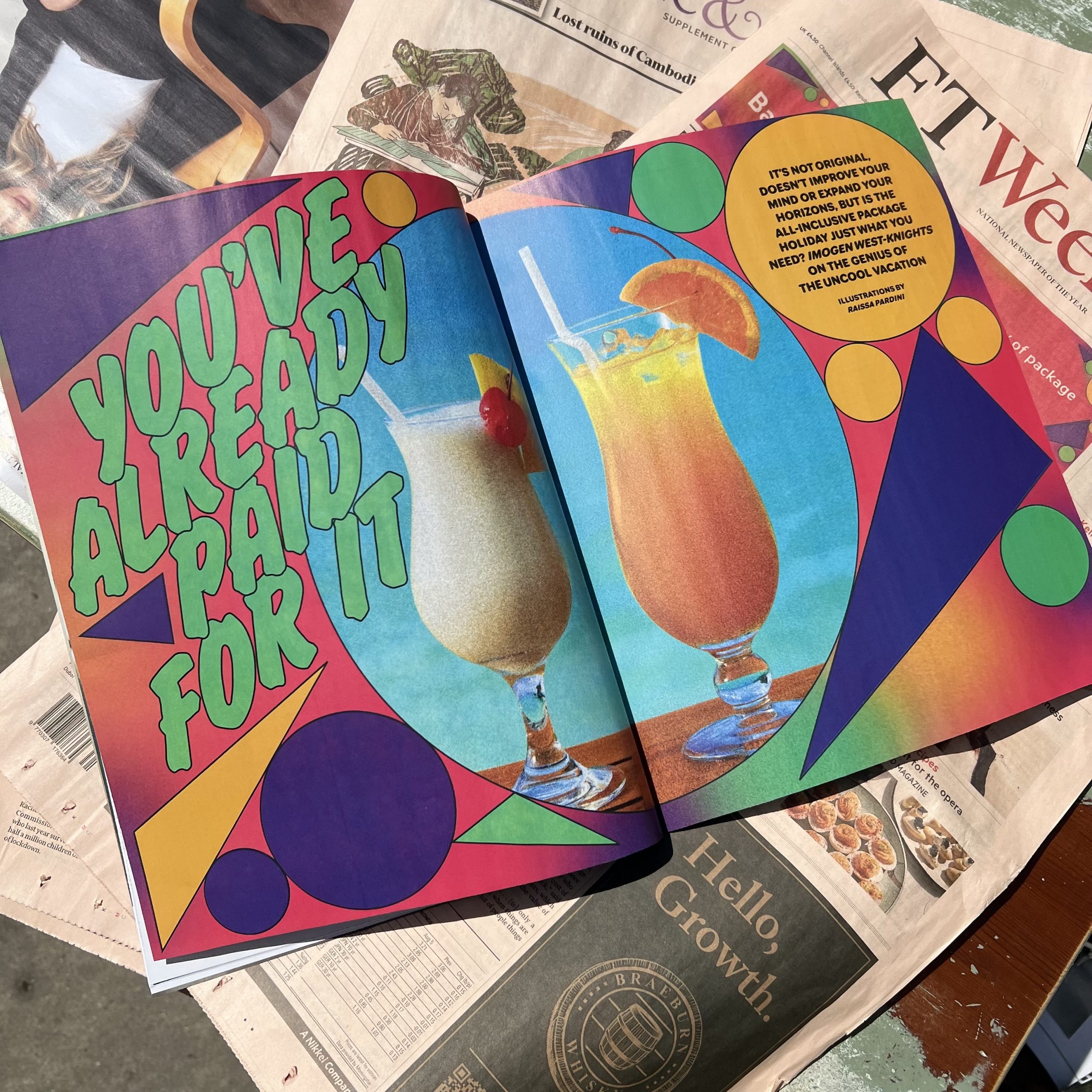
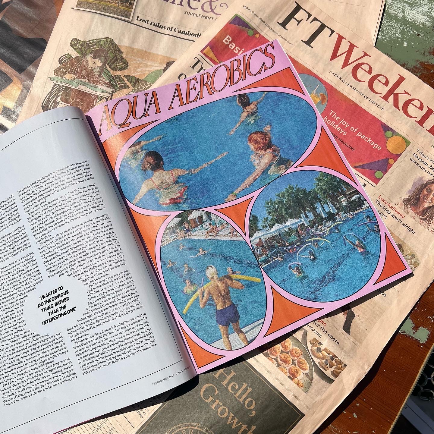
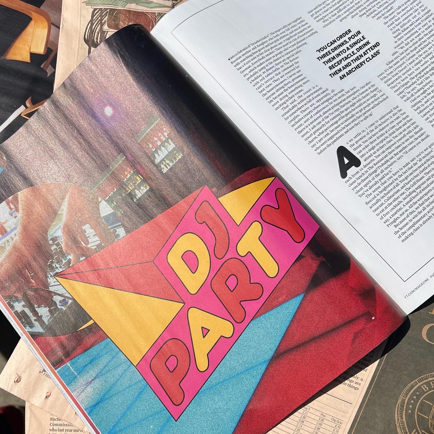
FT WEEKEND
FT WEEKEND, FINANCIAL TIMES, 2023
Raissa: "Very excited to be working alongside journalist and writer Imogen West-Knights on this cover story for the Financial Times' Weekend paper.
Imogen explores and observes the All Inclusive holiday nostalgia with ironic masterpiece writing moments. A very funny and clever read!
Article here.
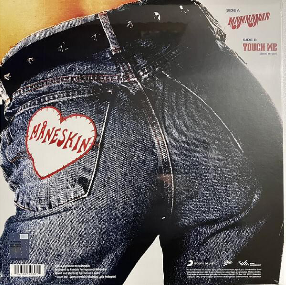
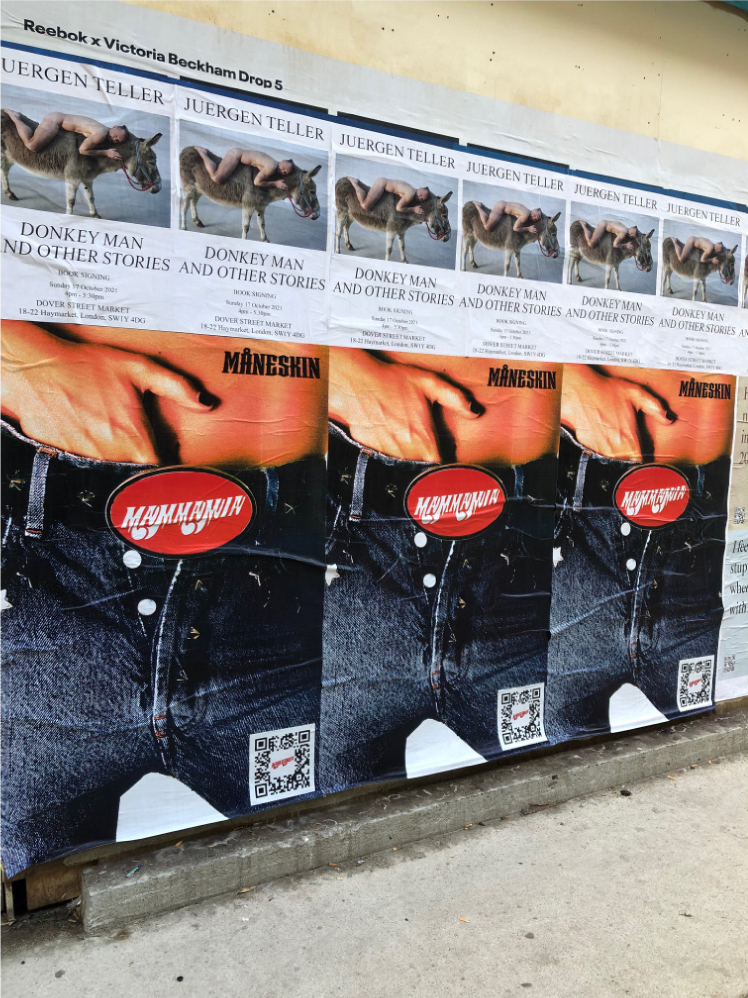
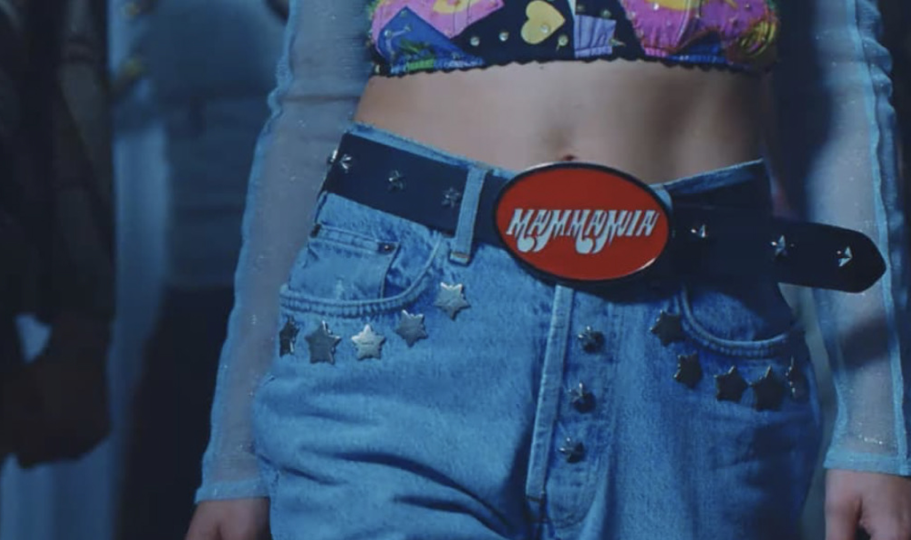
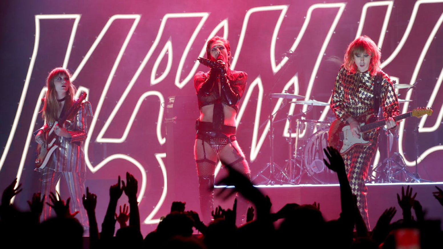
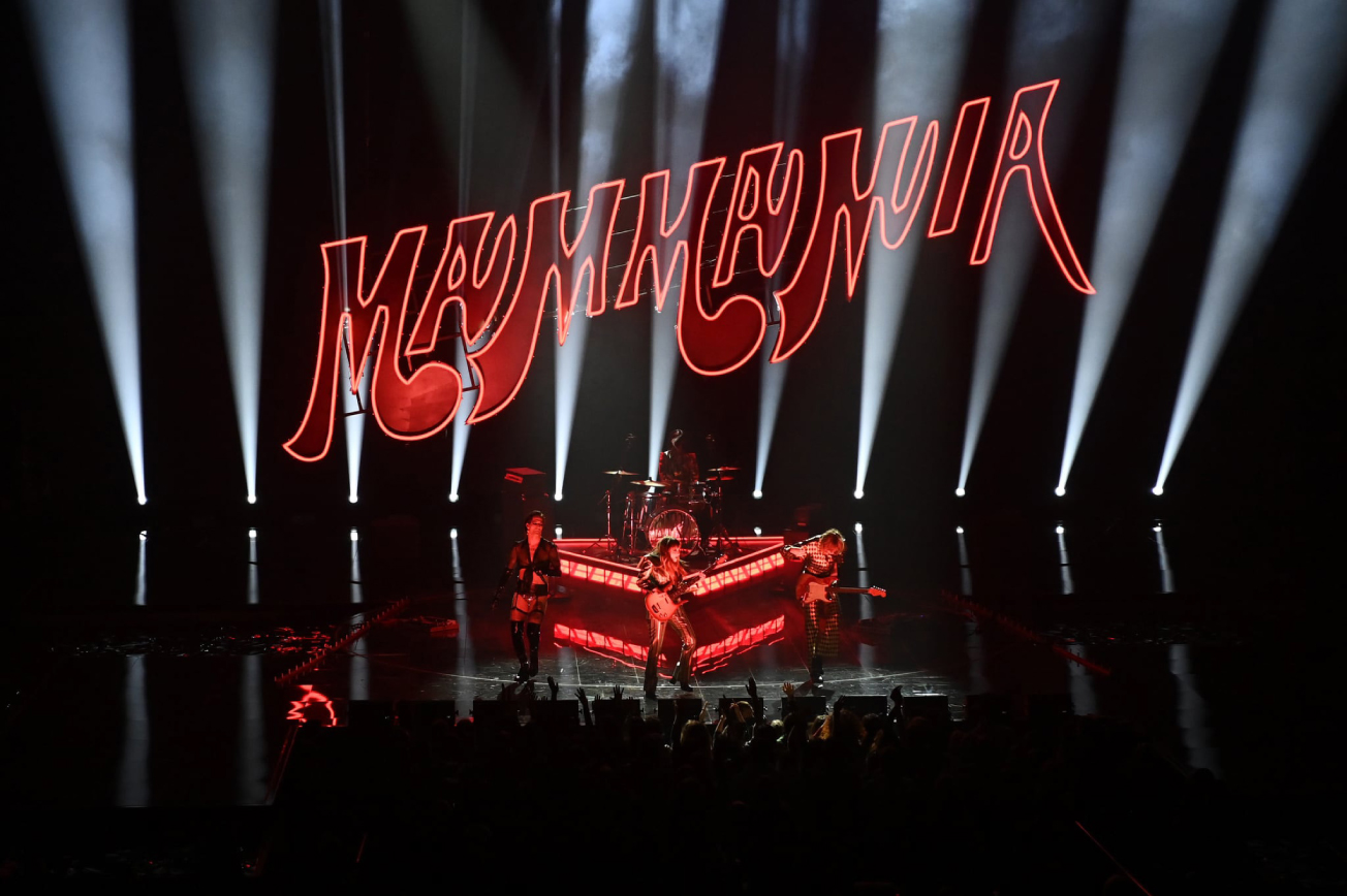
MANESKIN
MANESKIN, MAMMAMIA CAMPAIGN, 2022
We had the pleasure of working on the campaign that launched mane skin international. We created bespoke type assets for the covers, stages, posters, merchandise, videos.
MANESKIN, HONEY, ARE U COMING? CAMPAIGN, 2023
We worked on a bespoke type asset campaign for their latest single "Honey, Are U Coming?".

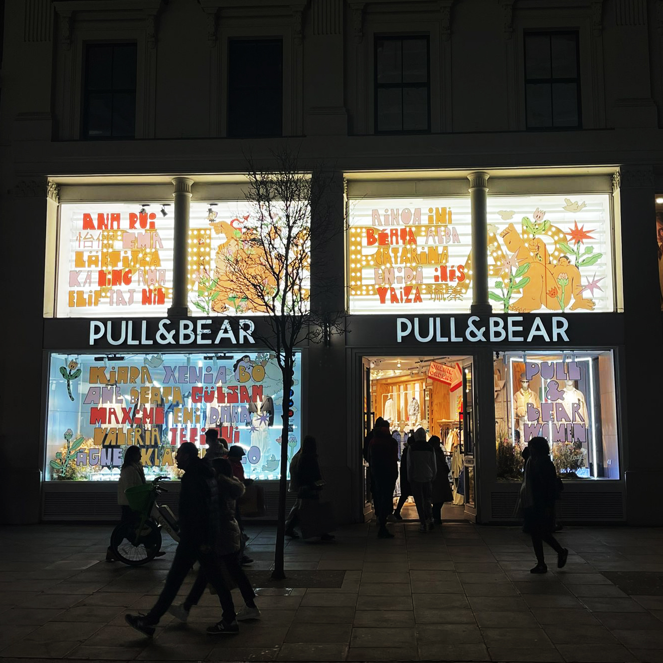
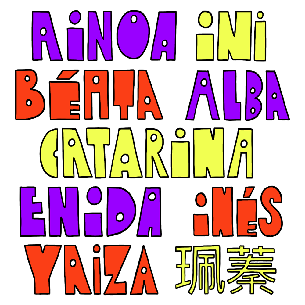
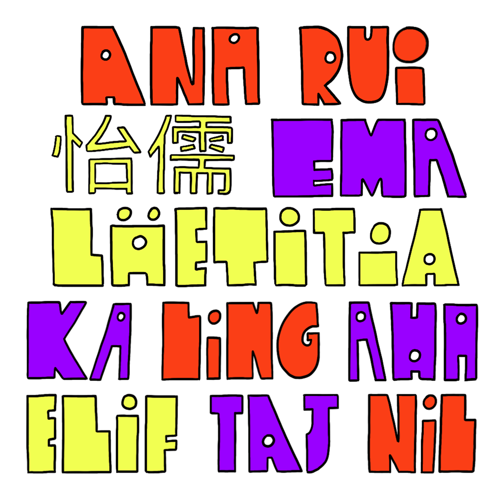
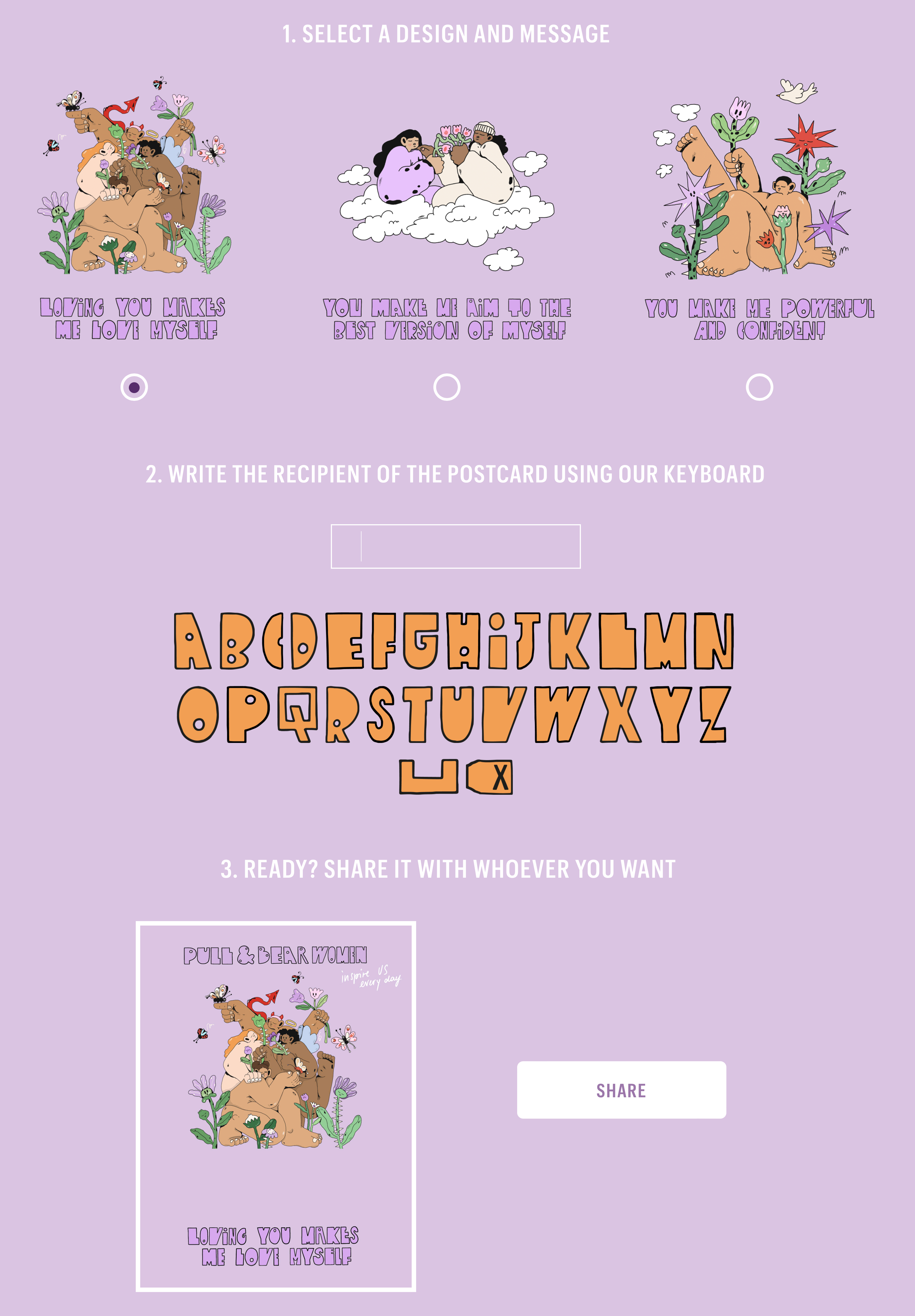
Pull & Bear shops
PULL&BEAR EU SHOP FRONT DESIGN, 2023
We collaborated with illustrator Poppy Crew and teamed up with our design on this incredible campaign with Pull & Bear. We created a special type, inspired by all body shapes and curves, to launch the campaign on International Women's Day.The designs were on their flagship windows in Oxford Street, London; Paris; Madrid; Berlin; Amsterdam.We also worked on their website and personalised messages to create with our alphabet.
Watch some BTS about me and my work here.


MONOTYPE
The iconic (2024) Type Trends Report from the one and only Monotype is finally out and you can download their case study from their website.
Raissa: "I created each letter looking at these trends and I made them into a black and white explosion of graphics. Extremely honoured to be the one who looked after this project this year."
Huge thanks to Marie.


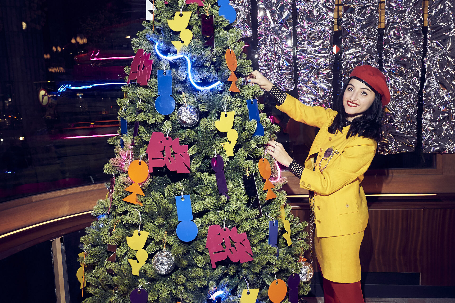
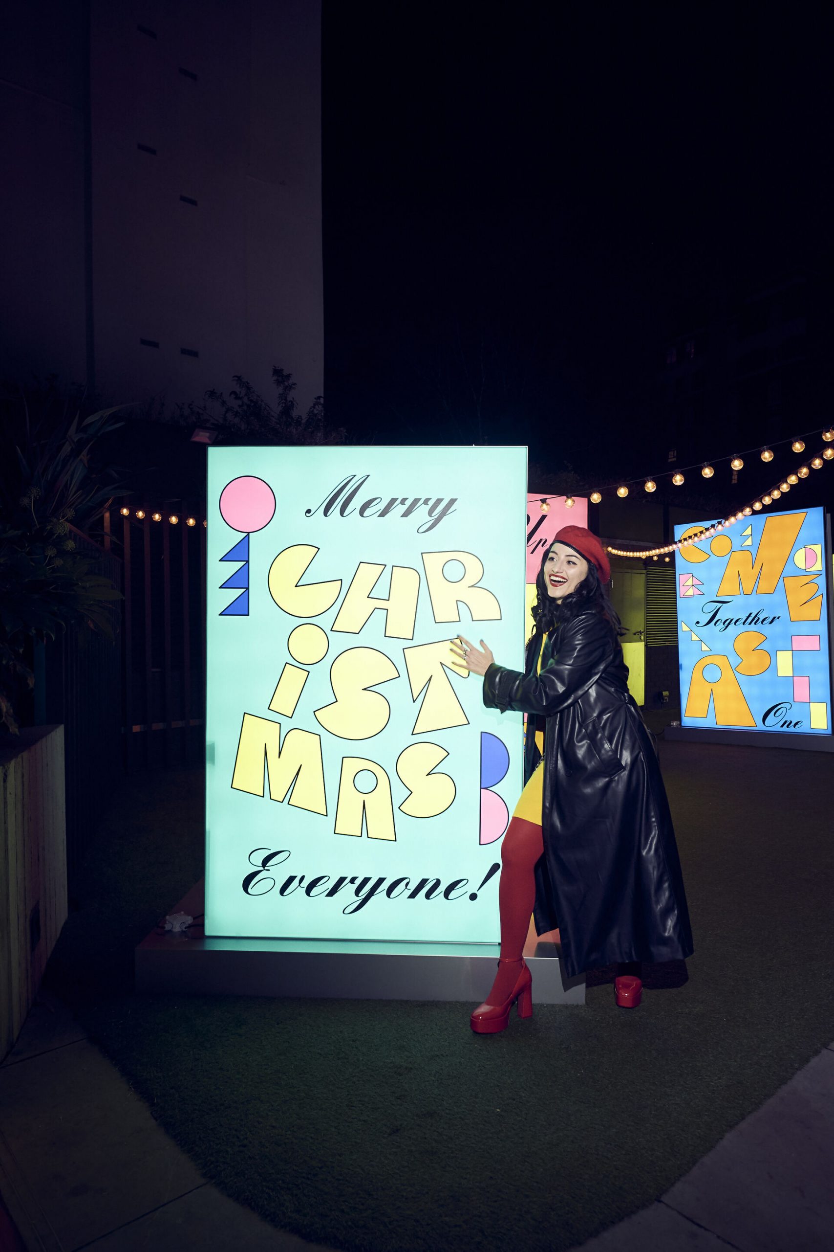
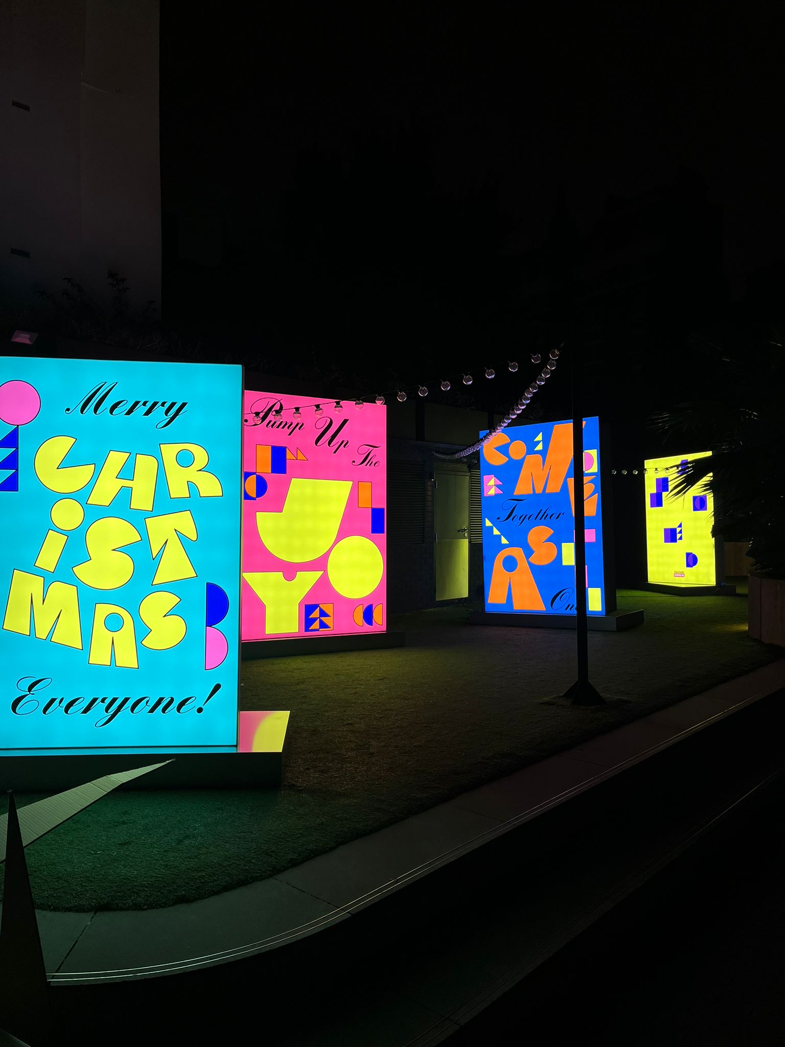
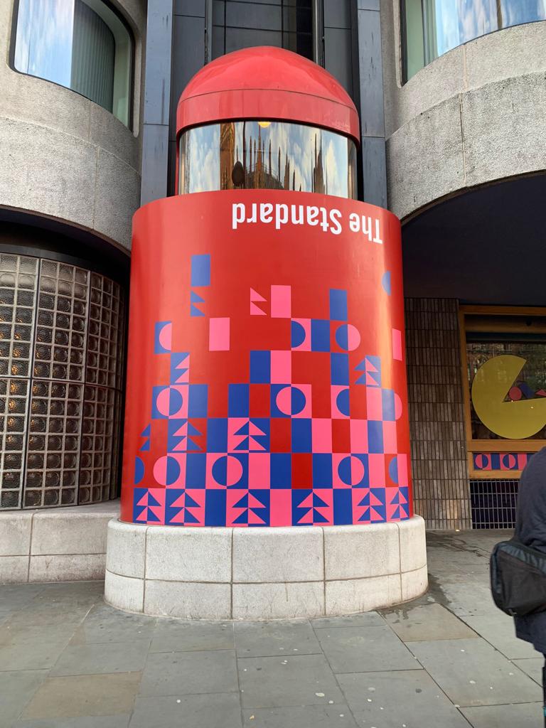
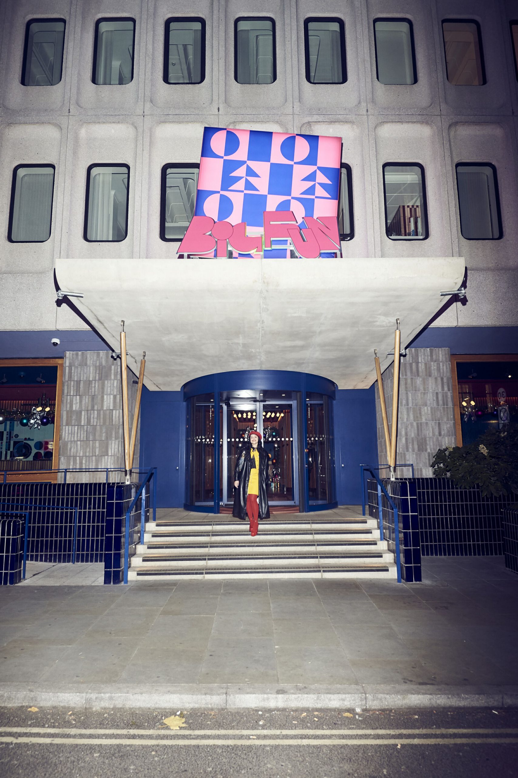
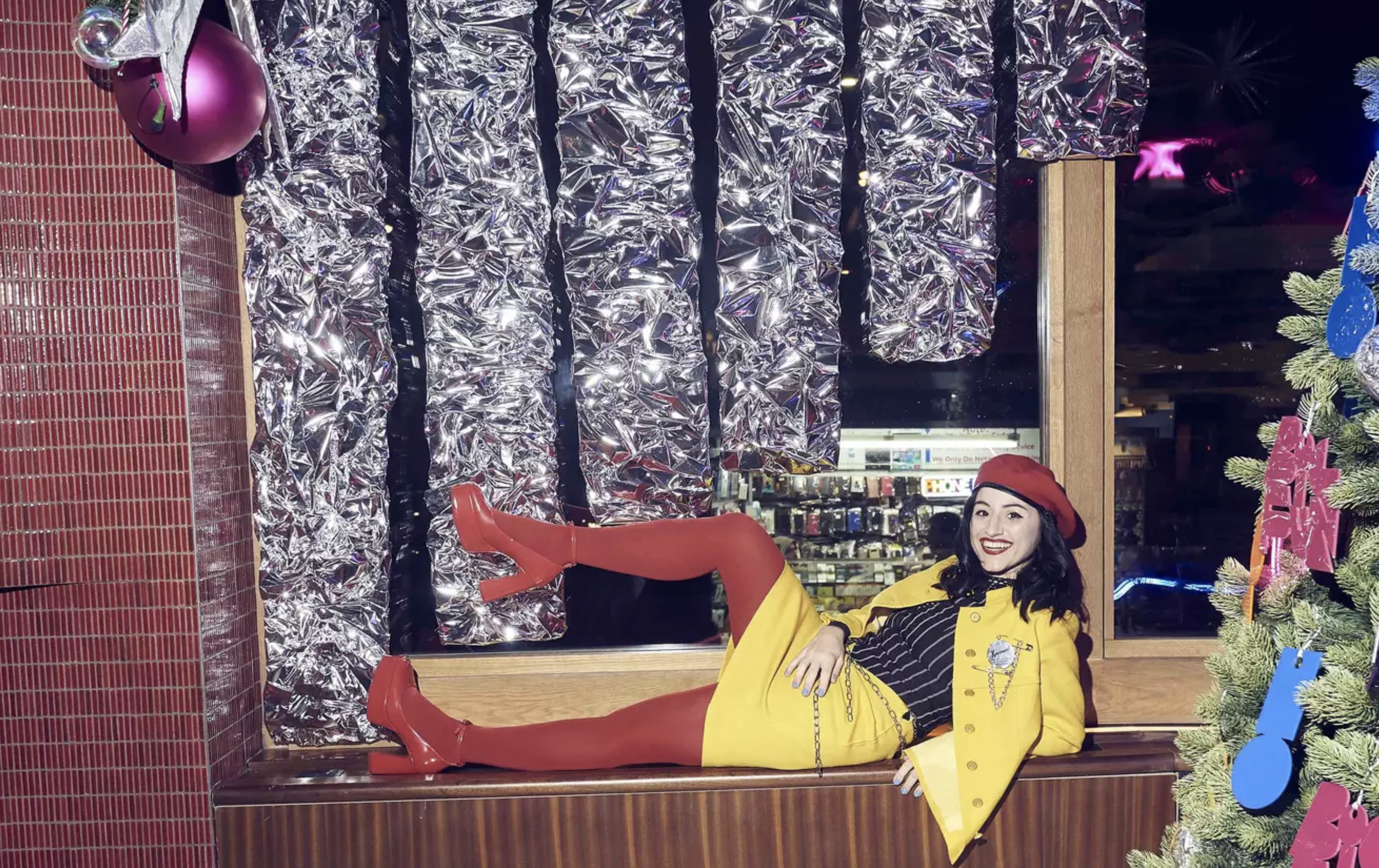
THE STANDARD HOTEL
THE STANDARD HOTE, LONDON, 2022
Raissa: A huge honour to be asked to be the artist in residency for iconic The Standard Hotel Christmas installations. I represented the spirit of London for the Big Smoke Hotel : )
I loved working with any type of space and material, from foil to PVC, creating different areas of the hotel, being inspired by its extremely cool history and graphical details. I worked on a special bespoke type for them which was printed in huge sizes on their windows to Kings X station. The type was made into Christmas fun cards, away from the traditional messages - with a sense of collective love. The cards were part of the merch, alongside Christmas balls, pins, bags. The cards were printed as big installations for the communal area at the back of the hotel too. The merch included bespoke Christmas decorations that filled our enormous Christmas tree too. Working simultaneously with lighting, set up, areas and installations was really good fun. BIG FUN!
Watch the video here
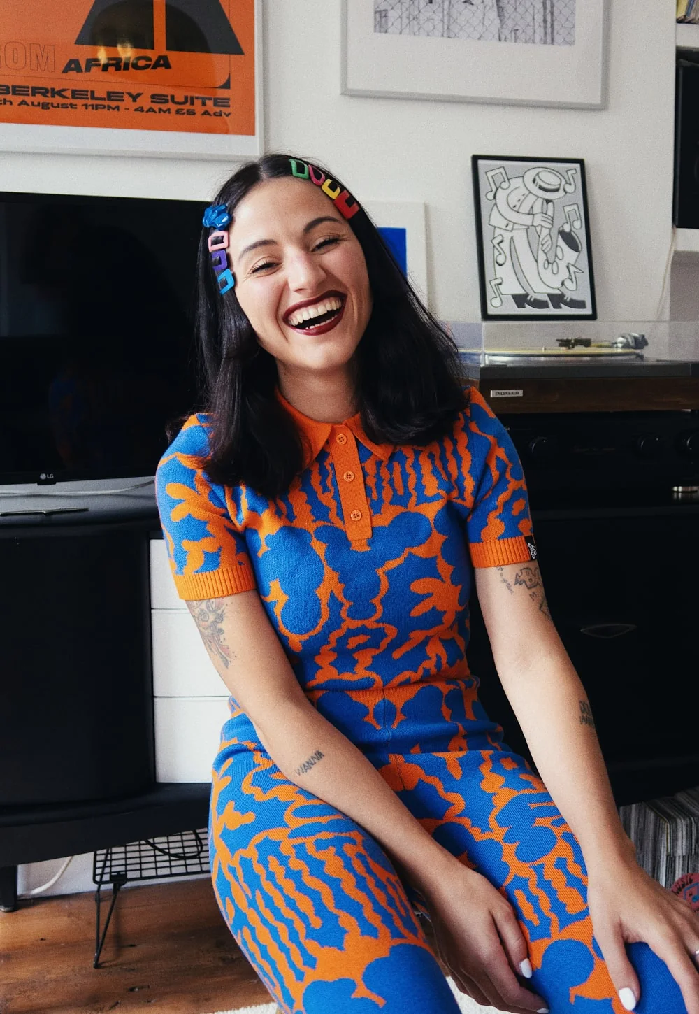
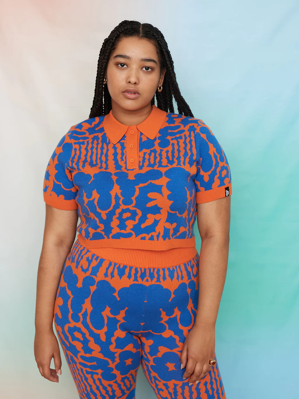
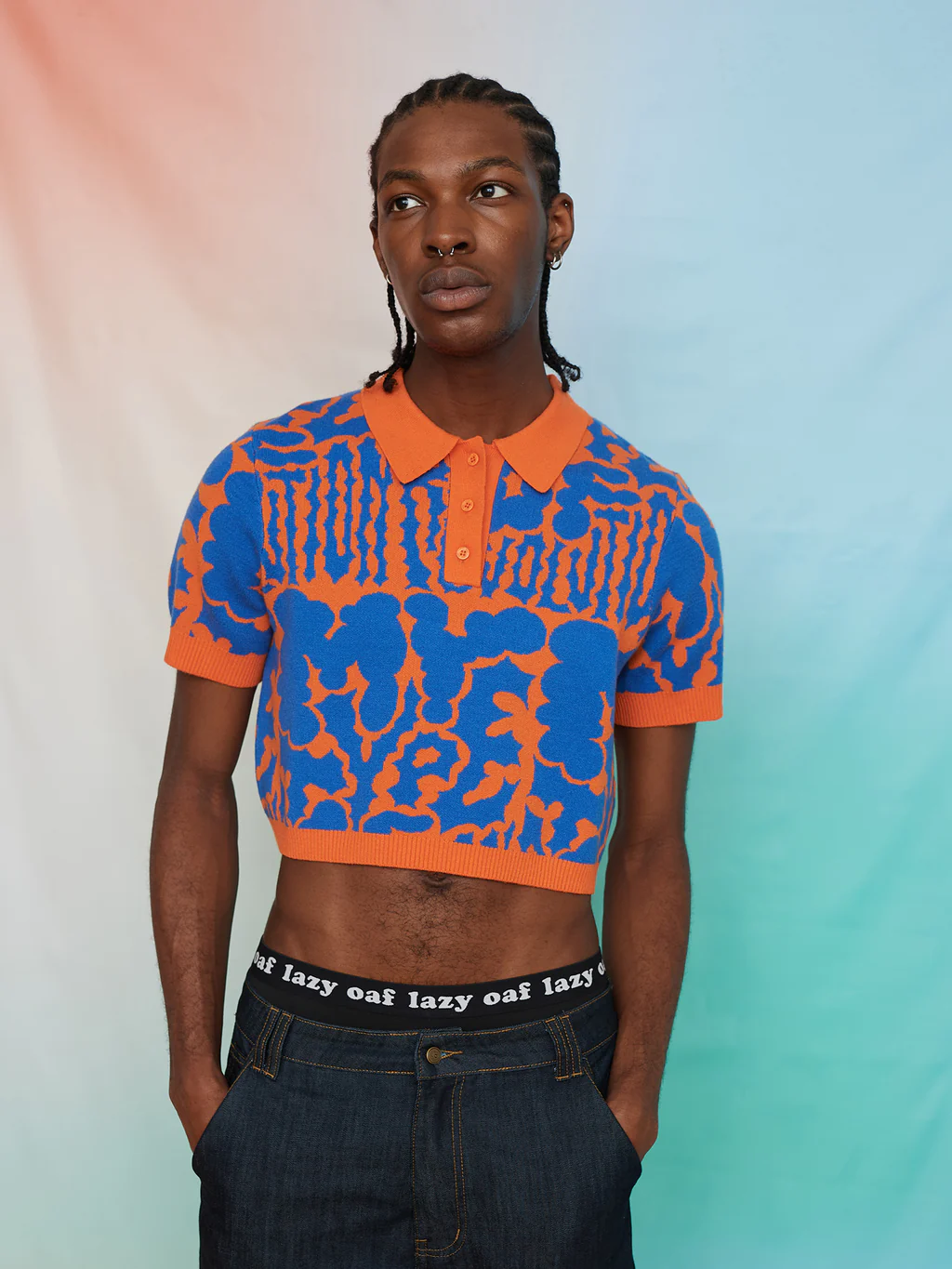
LAZY OAF
RAISSA PARDINI X LAZY OAF, 2022
Do Good Art Club, Lazy Oaf's non-profit capsule collection platforming emerging artists while raising money for the causes they care about.
Each artist's work is featured across a limited edition collection of hero styles, and 100% of the profits will be split equally between three charities; one of each artists’ choosing.
Raissa created two pieces for this capsule collection. She has chosen to support Endometriosis UK, a charity that provides support for those affected by endometriosis whilst also campaigning for a better societal understanding of the disease.
All items are gender neutral and size inclusive.
Read the article here.
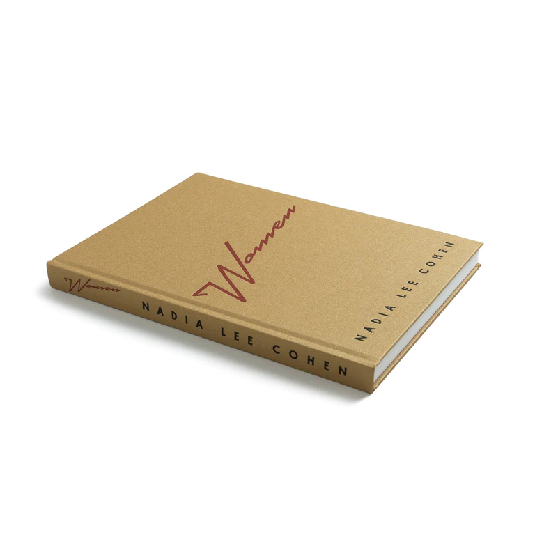
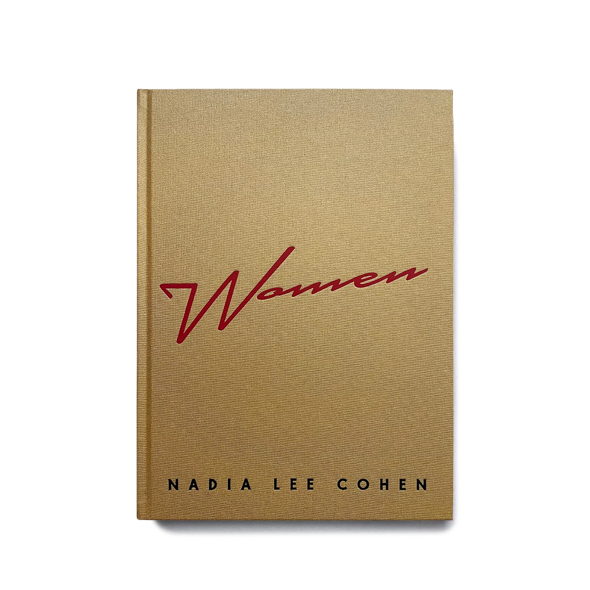
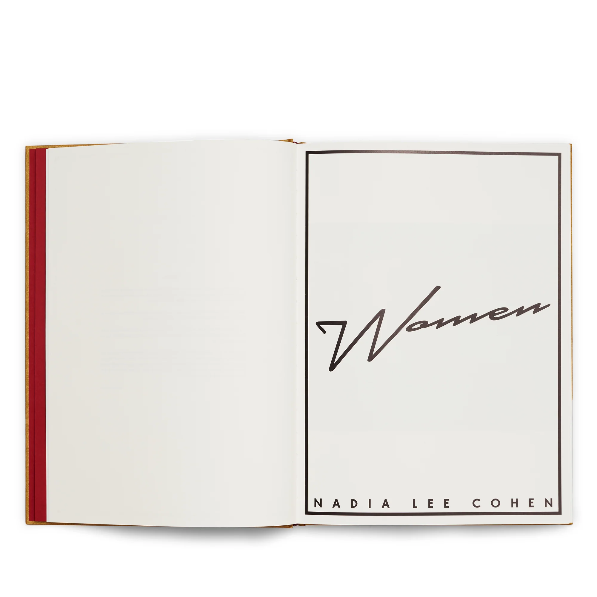
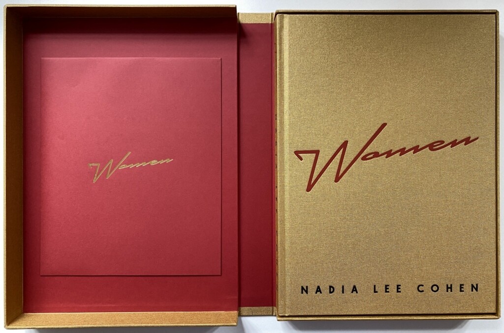
NADIA LEE COHEN "WOMEN"
WOMEN, Nadia Lee Cohen (IDEA) 2021
We had the huge honour to work on Nadia Lee Cohen’s very first book “Women: Six years in the making”, published by IDEA.
From Georgia May Jagger to Charli XCX, WOMEN is both hyper-surrealist pop iconography and deeply moving.
Naked in its honesty.
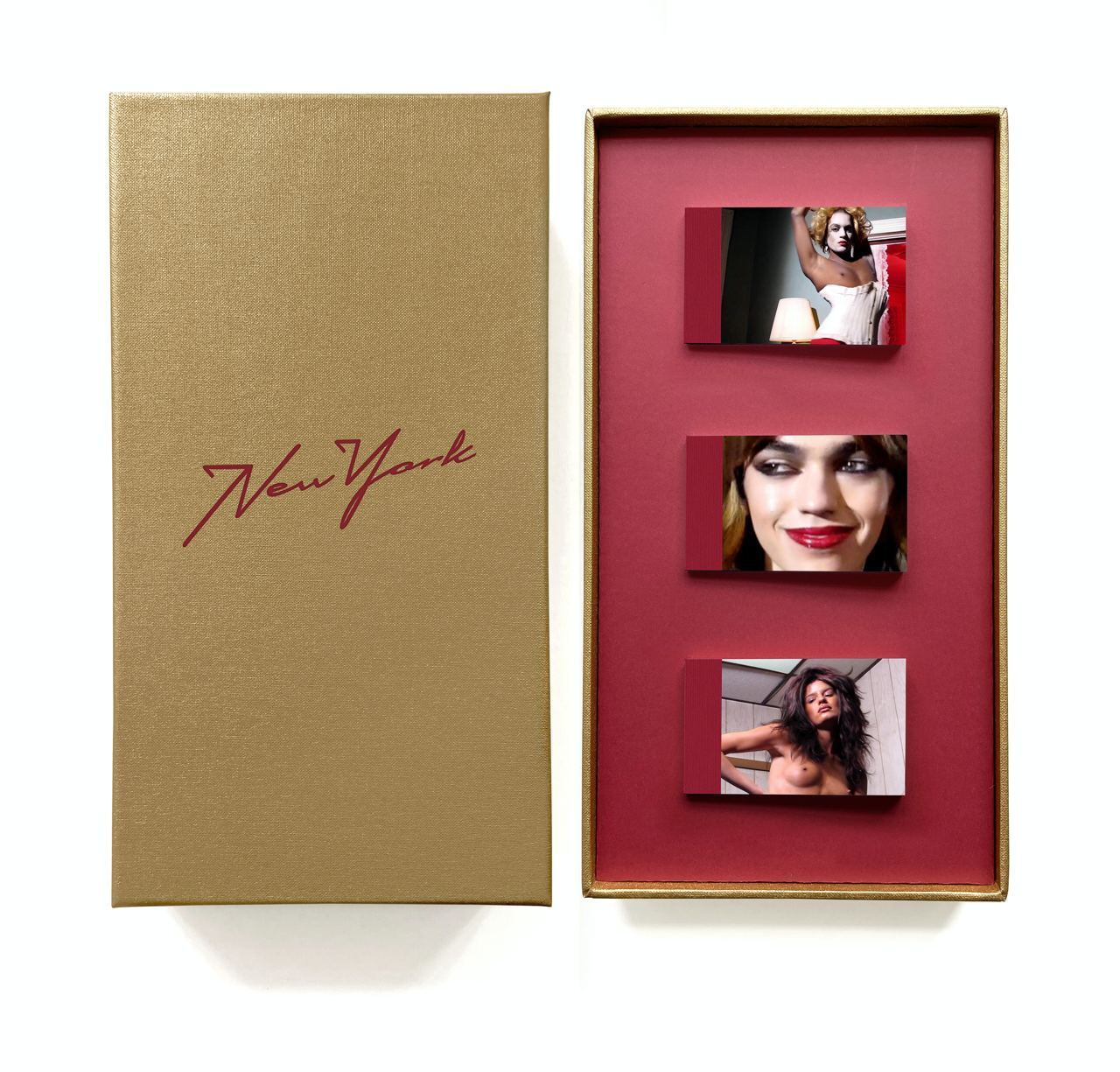
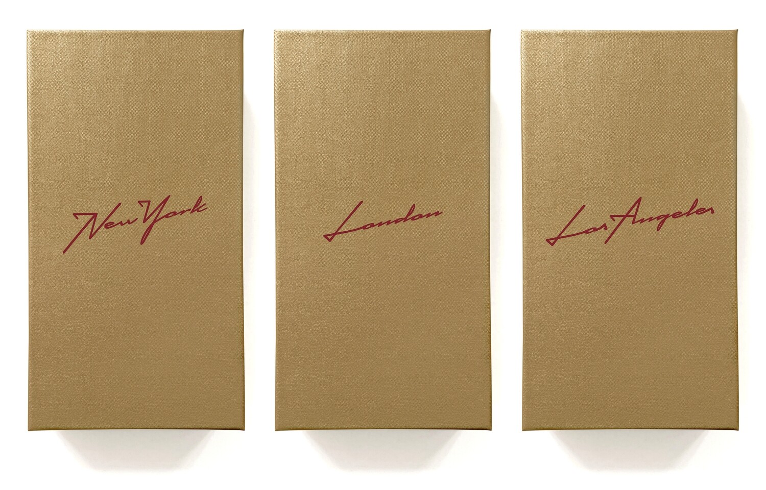
THE FLIP BOOKS, Nadia Lee Cohen (IDEA) 2023
We had the huge honour to work on this incredible box set.
In celebration of Photo London, IDEA published a special limited edition project featuring the filmed version of the set-ups for the photographs in the now four-times sold-out title. An opening like no other at Dover Street Market. The flip books were showing stills taken from her filmography screened as part of an installation - a standalone three-seater cinema where the films are being projected.
Each box represents the city in which the films were shot, corresponding to London, New York and Los Angeles. In total, there are 684 new Lee Cohen images across the whole edition.
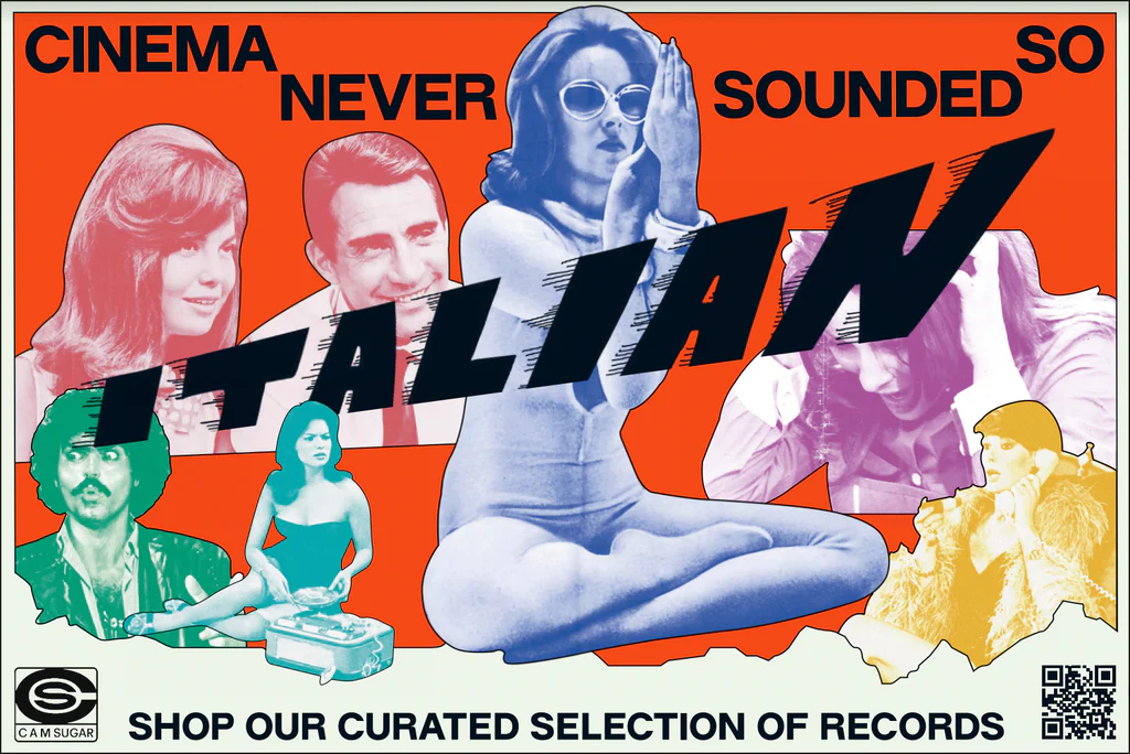
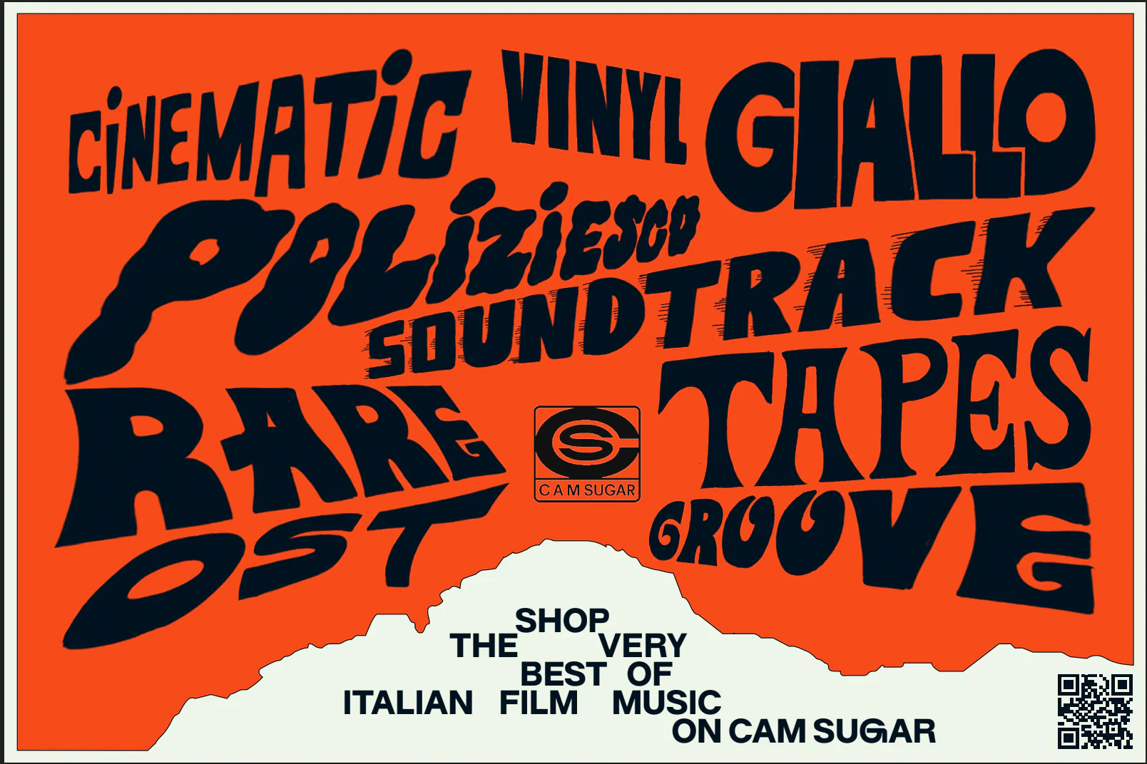
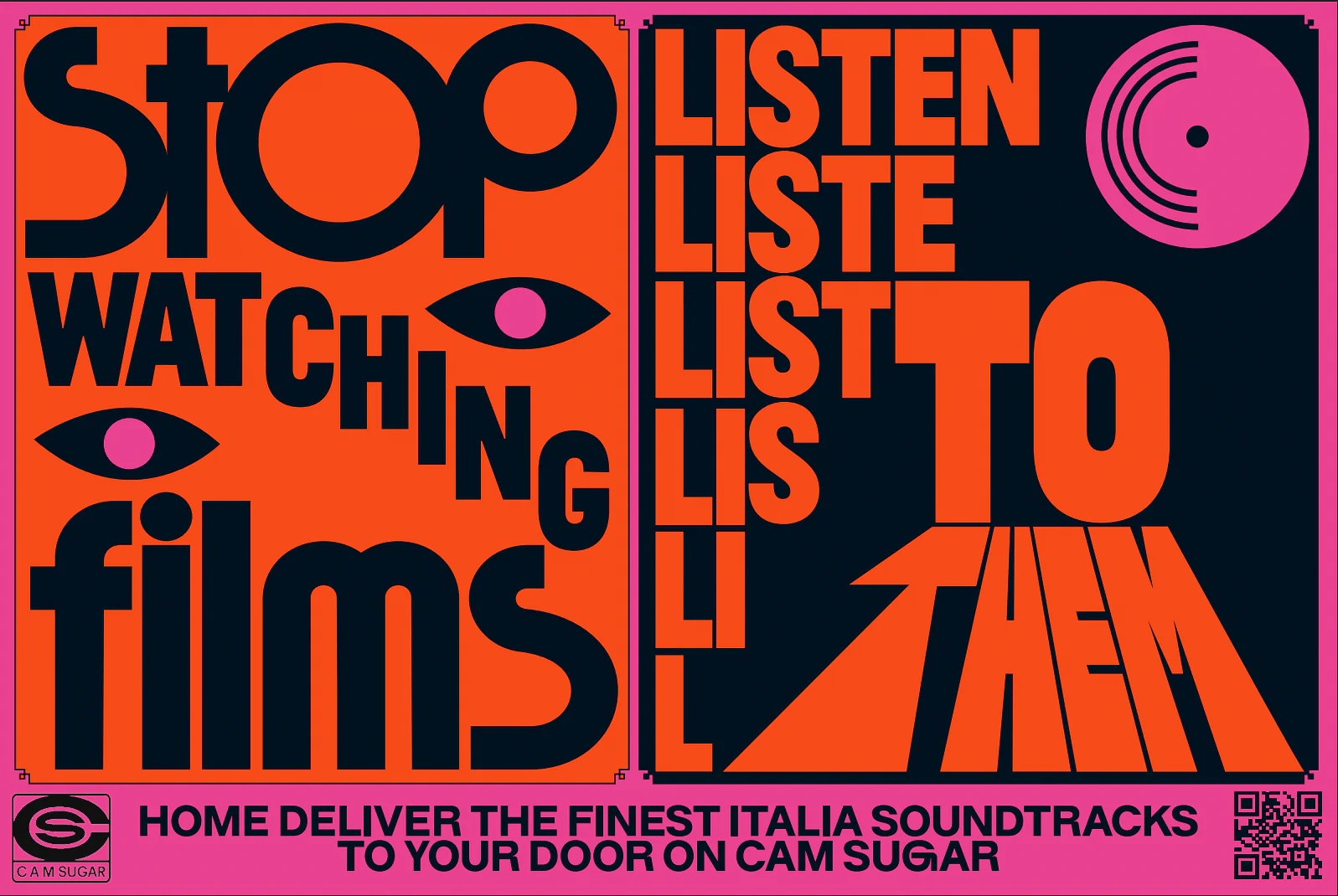
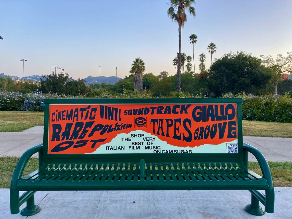
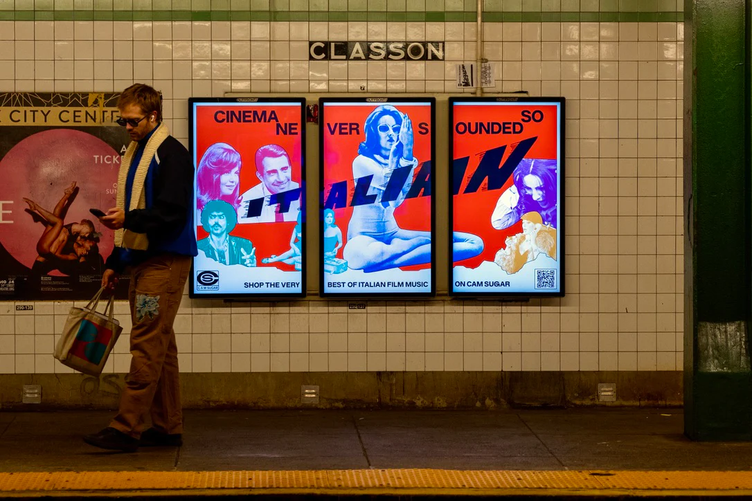
CAM SUGAR US BILLBOARDS
CAM SUGAR US LAUNCH CAMPAIGN, 2023
CAM Sugar takes over New York and Los Angeles with poster campaign in collaboration with artist Raissa Pardini.
Billboard campaign to launch iconic label CAM SUGAR catalogue to the US market. Printed and digital posters around LA and NY.
Lorenzo Ottone:
"The bond between Italy and the United States runs deep, with cinema and music often being a common ground, but not only. Think of the overseas success of classic Italian chanteuses, of the many trajectories the cuisines of the two countries shared – from pizza to fettuccine–, or even better to the tight connection Hollywood and its Italian counterpart Cinecittà had in the 1950s and 1960s, when Rome became known as “Hollywood-by-the-Tiberis''. Hence, it felt just about right to finally make CAM Sugar releases available on the other side of the Atlantic Ocean too.
The billboards mark the launch of our US online store, we took over New York and Los Angeles with dozens of print and electronic billboards to be spotted around the hip and cult neighbourhoods of Bushwick, Broadway, Bedford Avenue and Metropolitan Avenue in NY and the Hollywood area in LA. For the occasion we teamed up with graphic designer Raissa Pardini, whose Italian background and international music industry expertise seemed just perfect to visually narrate the identity of CAM.
Bold, colourful designs meet with a love for Punk and cinematic-informed cut-outs and a thorough study of lettering and typefaces, which were applied with different outcomes on the three designs exclusively conceived for the campaign.
“Working on this project meant I could combine my love for my country, Italy, with that for graphics and Italian soundtrack music. It came as a celebration of things that made Italy a spotlight in the world, which is exactly what CAM Sugar is doing as well now,” told us Raissa. The three different claims play upon an international rediscovery of Italian cinema from the perspective of one of its hidden treasures: music. Slogans like “Cinema never sounded so Italian” and “Stop watching films, listen to them” were matched by visuals that enhanced said feeling of synesthesia.
WETRANSFER / WEPRESENT
WETRANSFER/ WEPRESENT, 2021 Ideas Report
Each year, WePresent surveys 10k creatives from all over the world about the state of creativity right now. This survey is turned into some key creative insights that are relevant for this period in time and something the industry can learn from. I was commissioned to design the main look of these essays by making them more fun and playfull.
Using their huge platforms, Wetransfer and WePresent shared the reports last month.
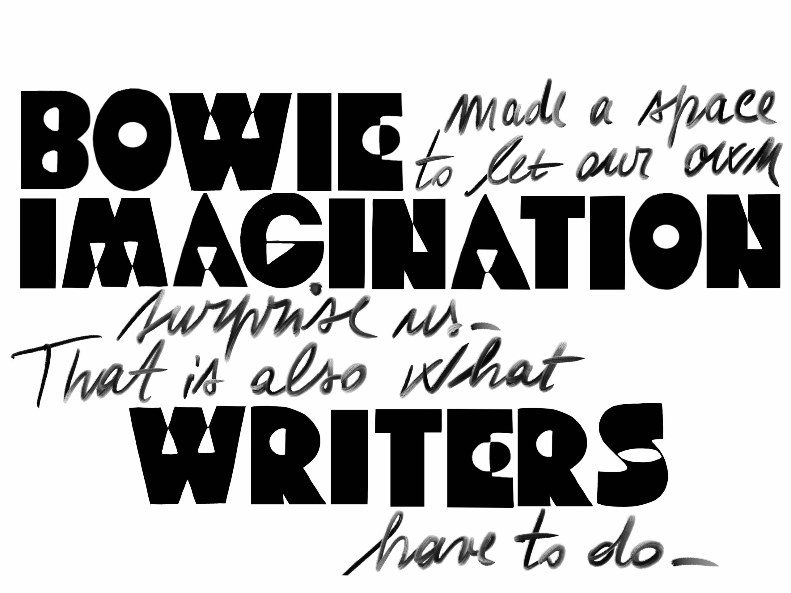
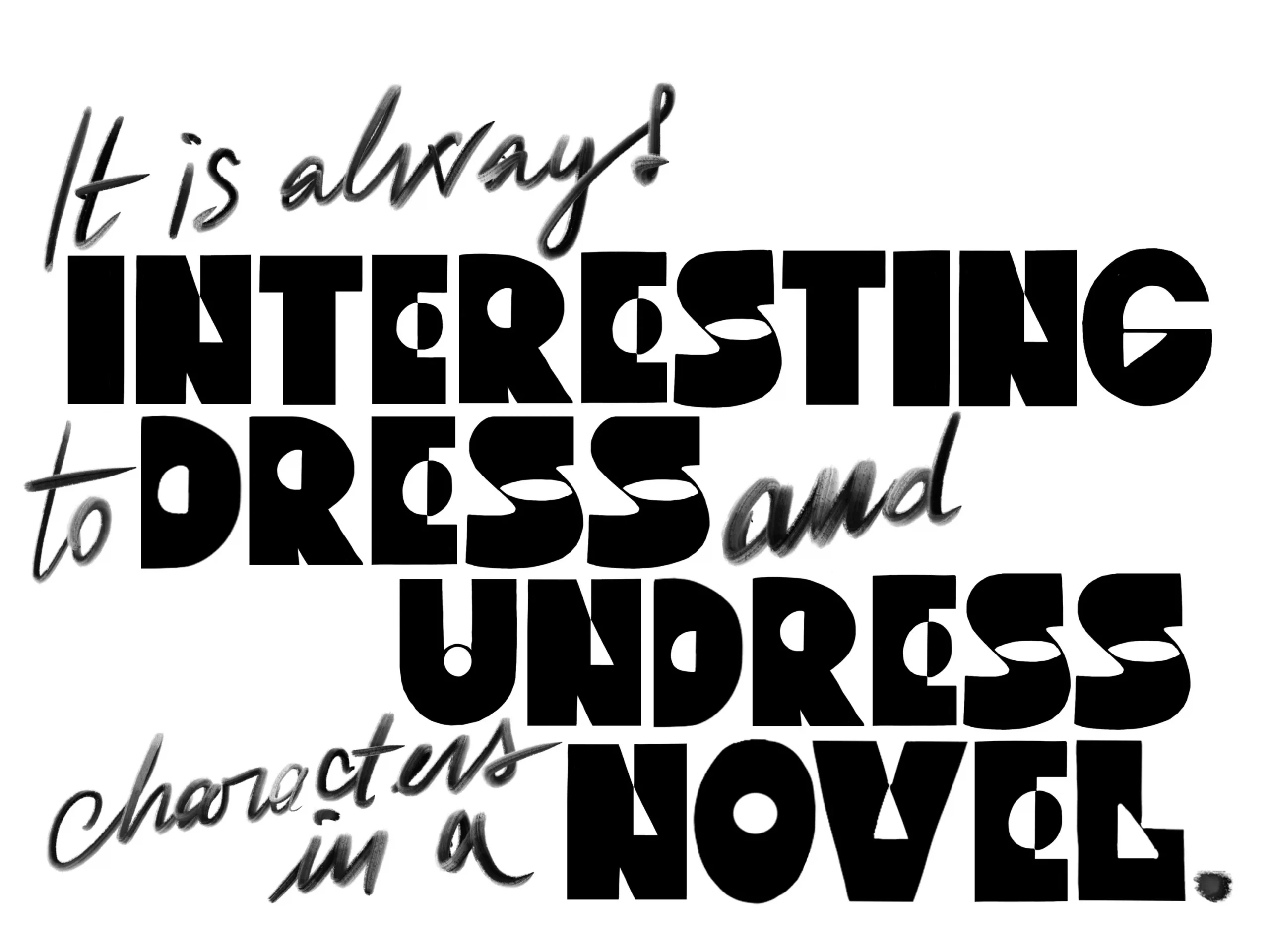
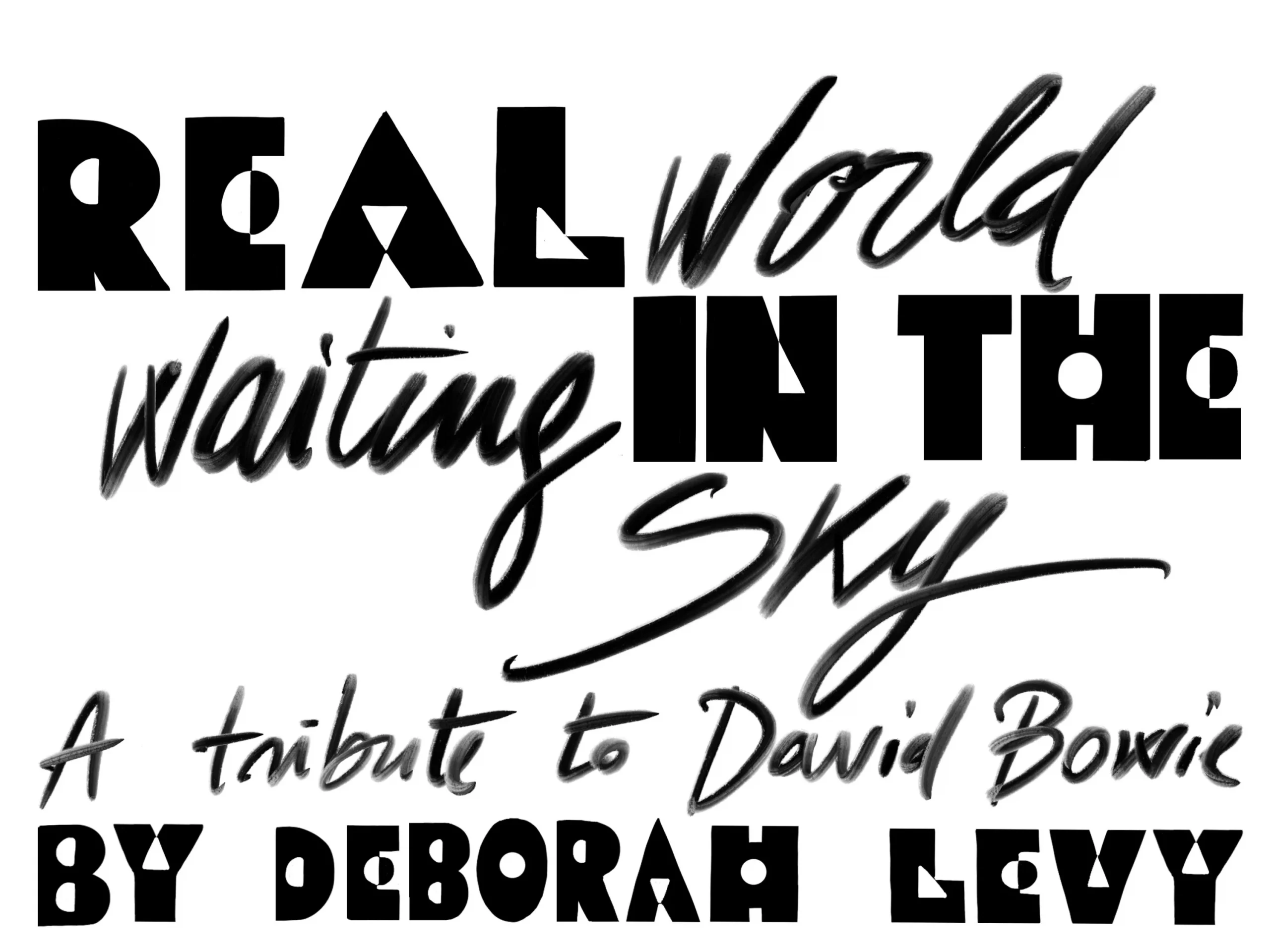
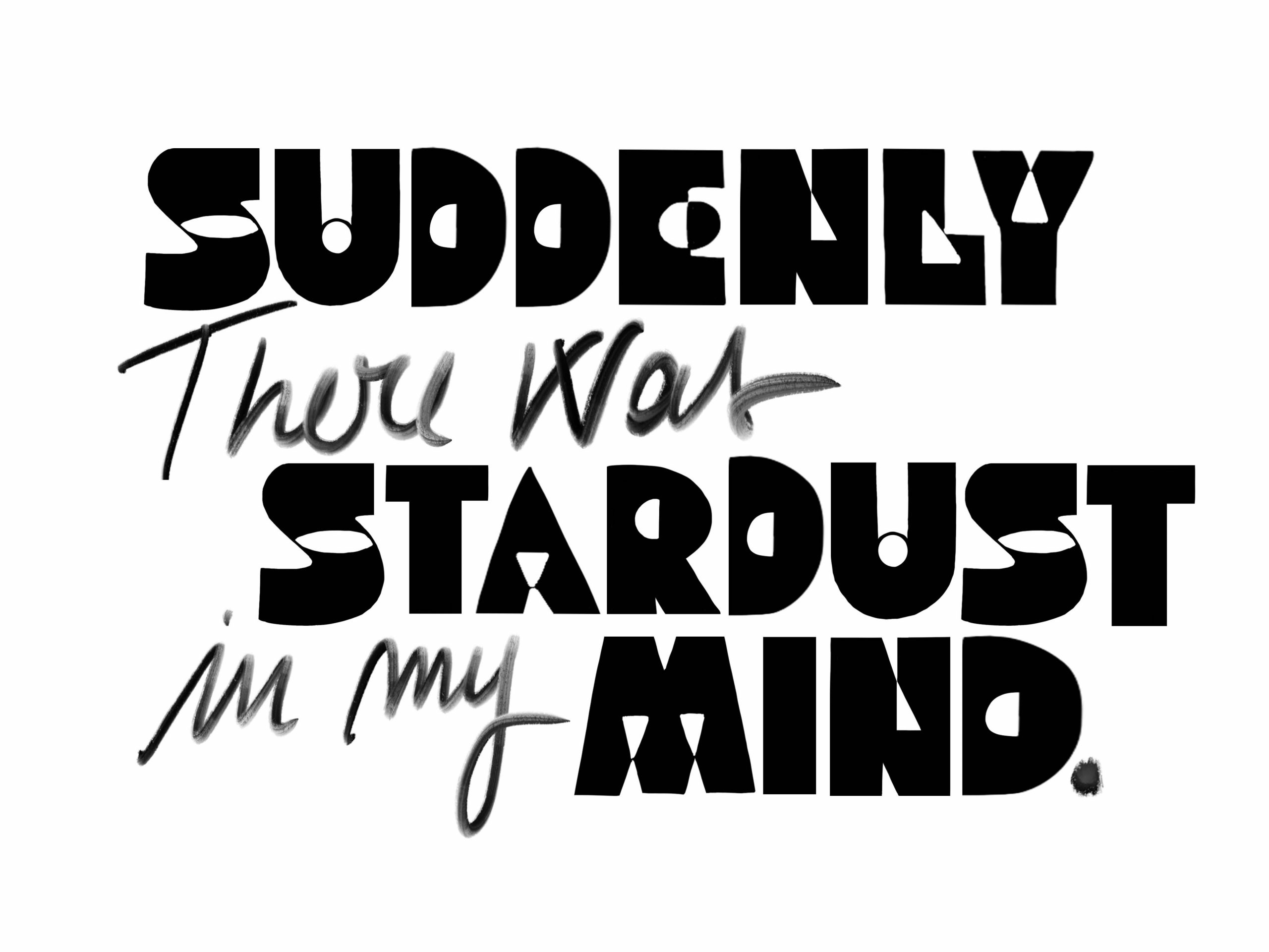
WETRANSFER/ WEPRESENT X David Bowie X Deborah Levy
Creating bespoke alphabets taken from various David Bowie's old designs, to illustrate this beautiful article commissioned to one of our favourite writers, Deborah Levy.
Article here.
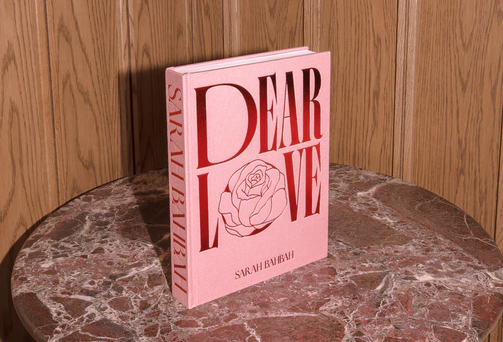
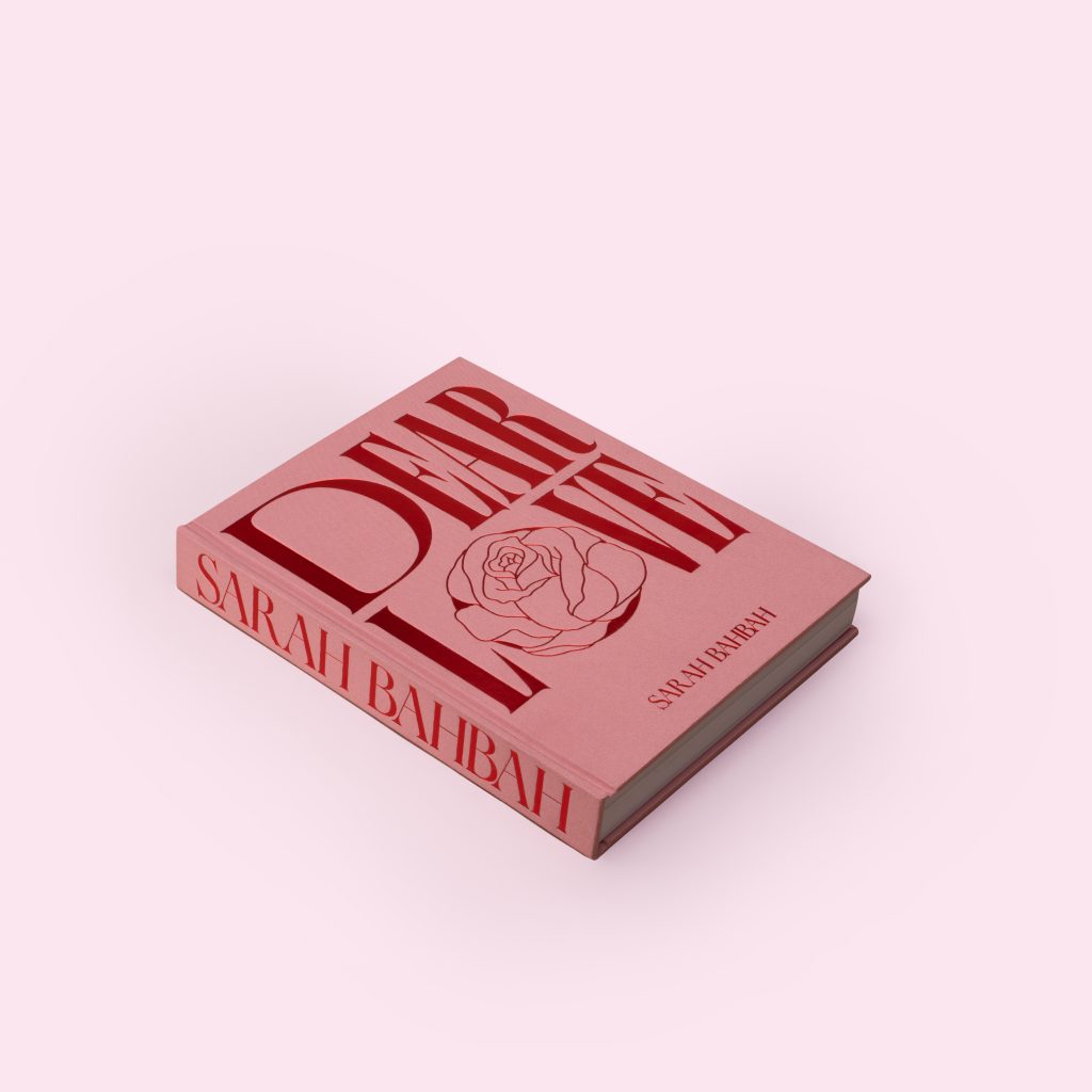
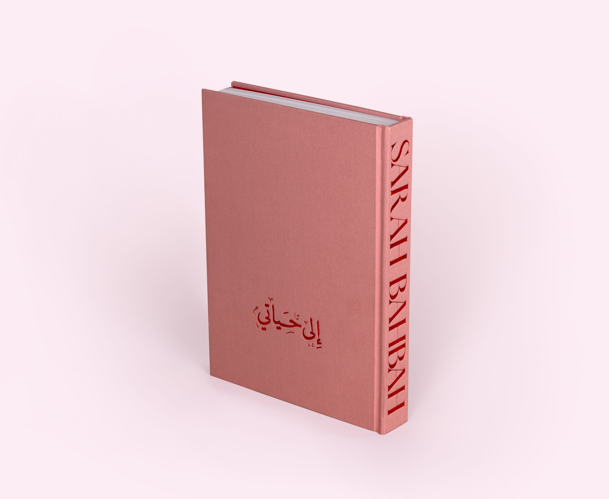
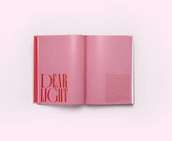
SARAH BAHBAH "DEAR LOVE"
DEAR LOVE, SARAH BAHBAH, 2022
It was an honour to create Sarah Bahbah debut's book "Dear Love". An autobiographical, intimate fine art book debut with great details and 10 years of stories and beautiful photography. We worked really hard on introducing very timeless graphics and paper treatments like the foil and the cloth cover.
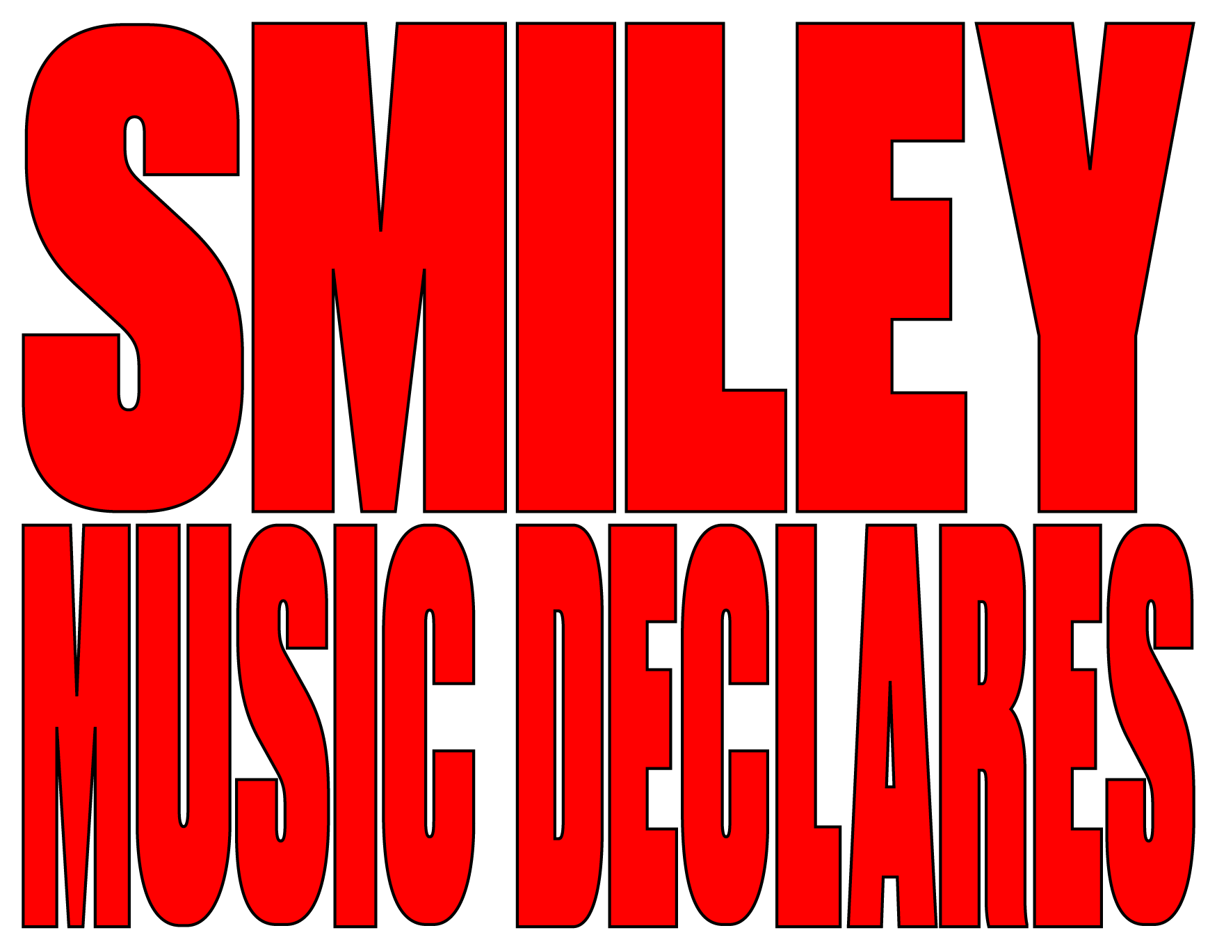
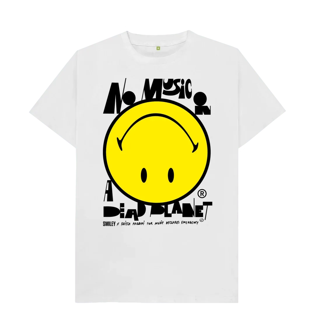
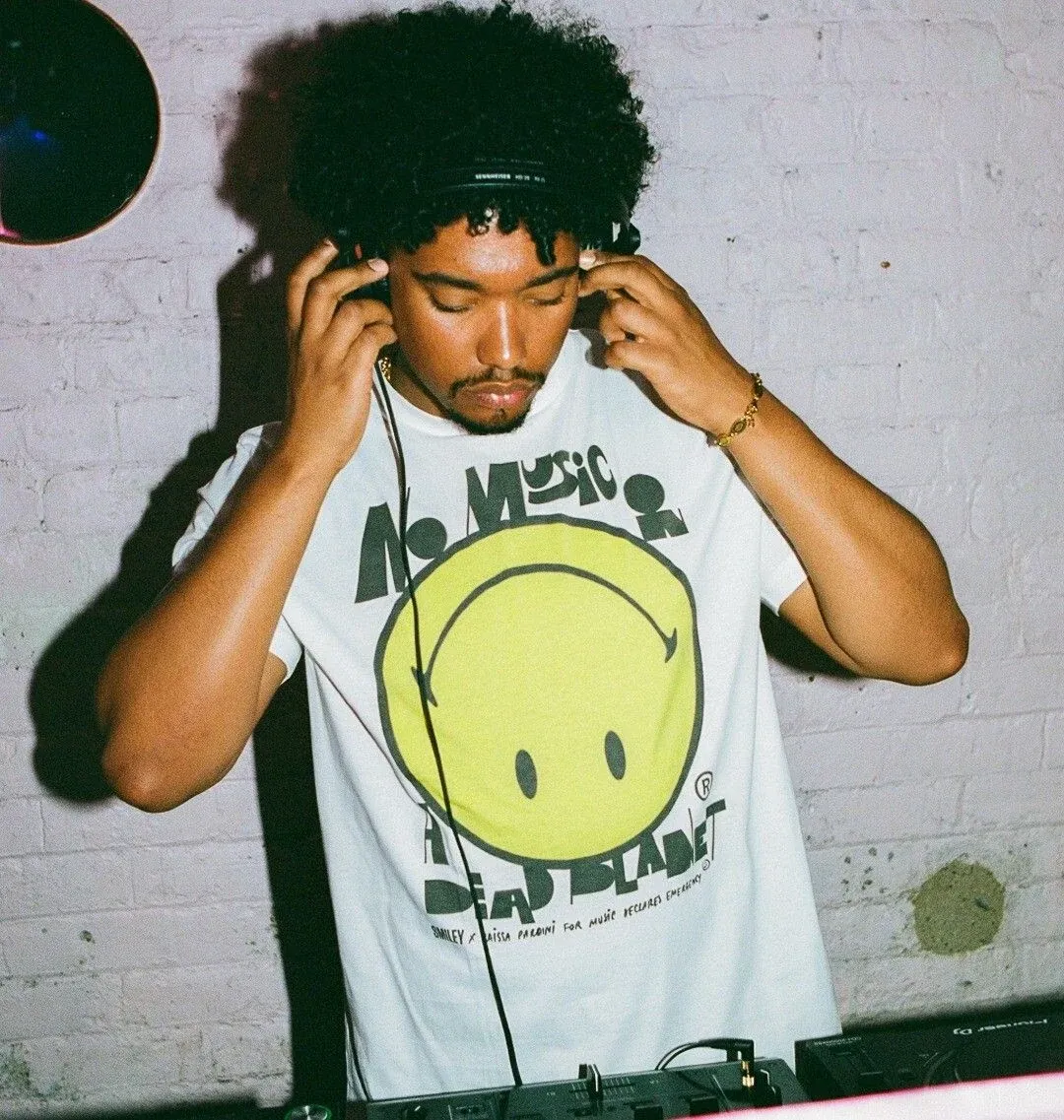
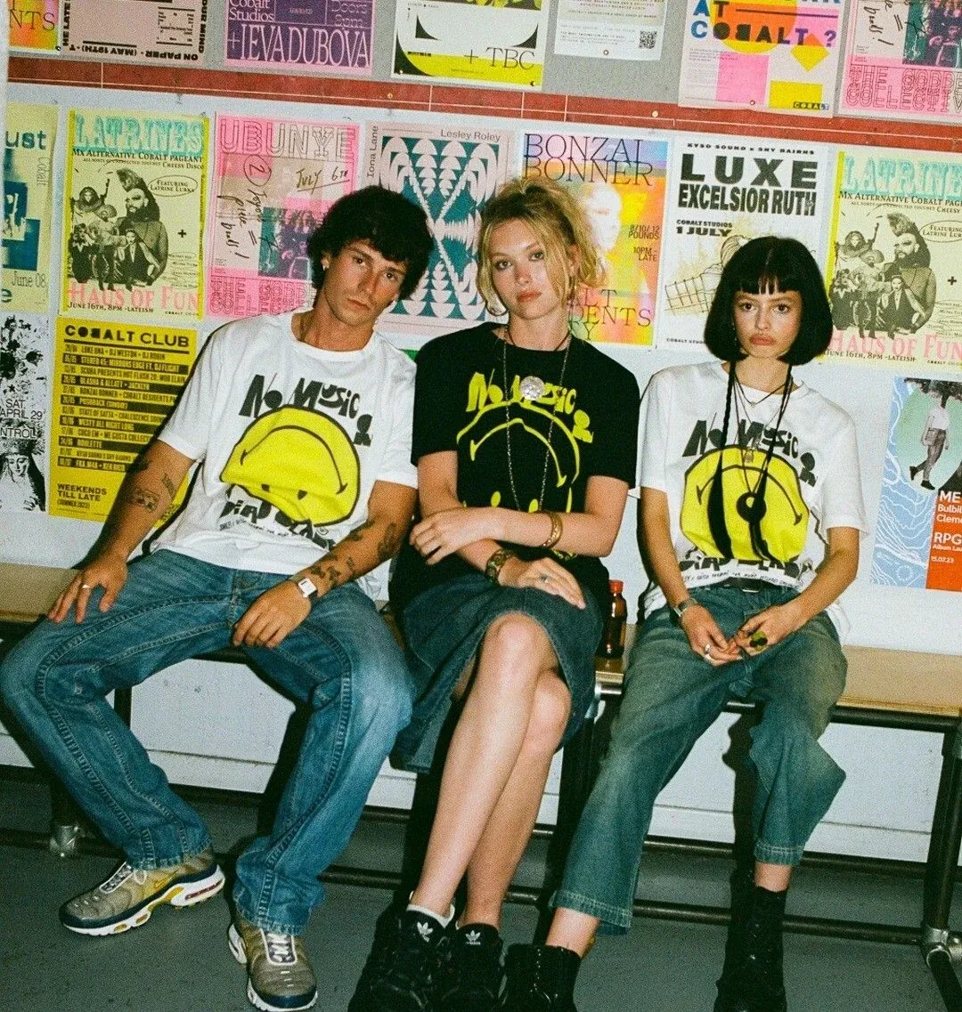
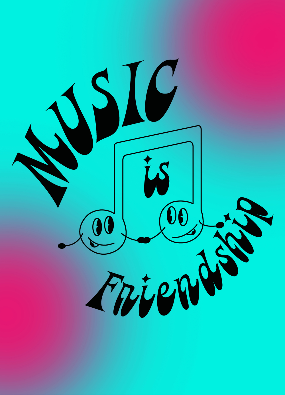
RAISSA PARDINI X SMILEY X MUSIC DECLARES
RAISSA PARDINI X SMILEY X MUSIC DECLARES, 2023
"Music Declares Emergency have partnered with the Smiley company to launch an official Smiley NO MUSIC ON A DEAD PLANET t-shirt, created for us by the ultra talented Raissa Pardini. With Smiley’s strong clubbing heritage, this design is a perfect choice to stand up in defence of music and the planet. This t-shirt is made from certified organic cotton and designed to be recycled at the end of its life, to feed into the circular fashion economy. Get yours today and support our campaign to demand an immediate governmental response to protect all life on earth. Size up for an oversized fit."
Raissa: I desired to go for a very edgy but readable bespoke type for this one. Keeping the DIY vibe but accessible for all!
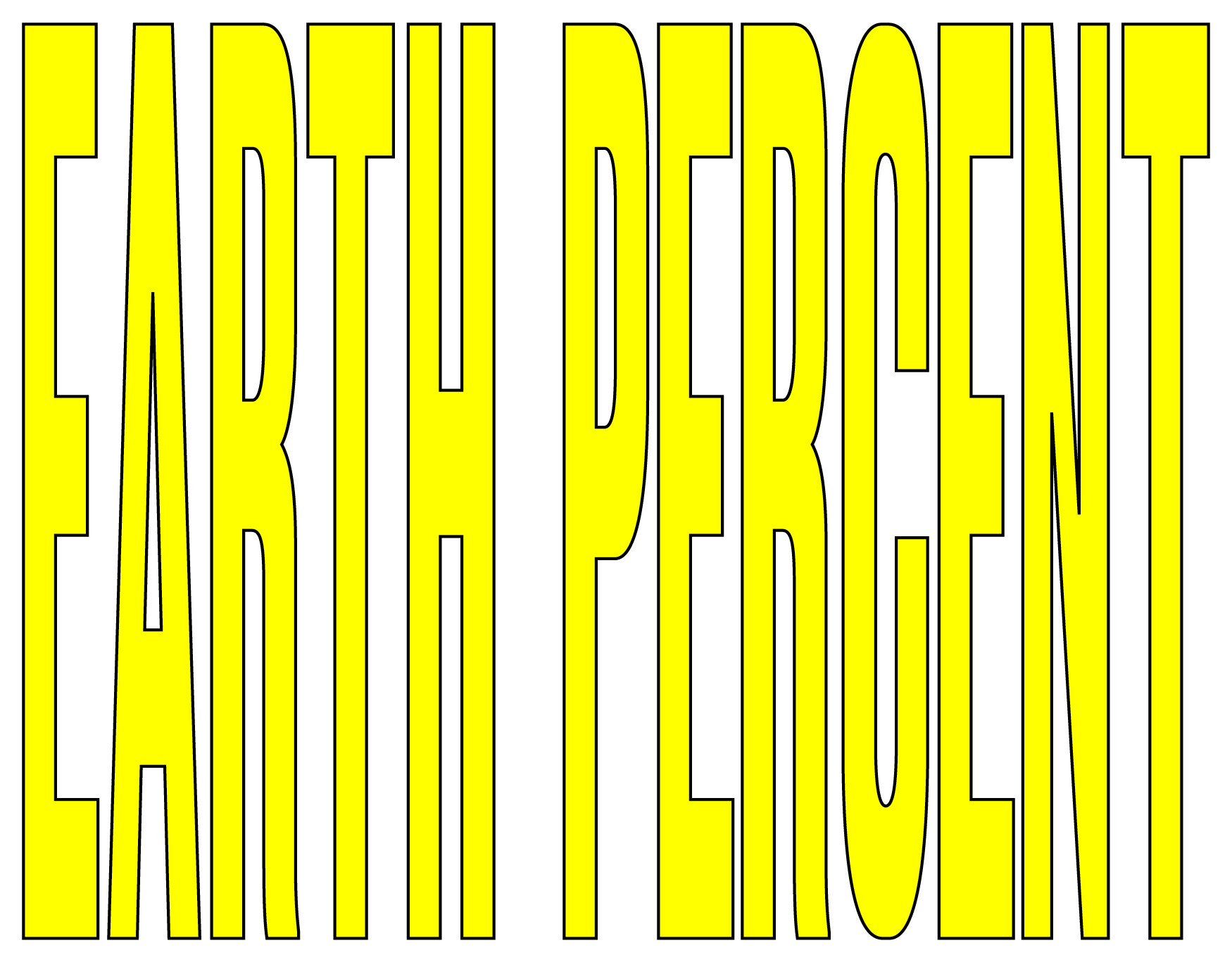
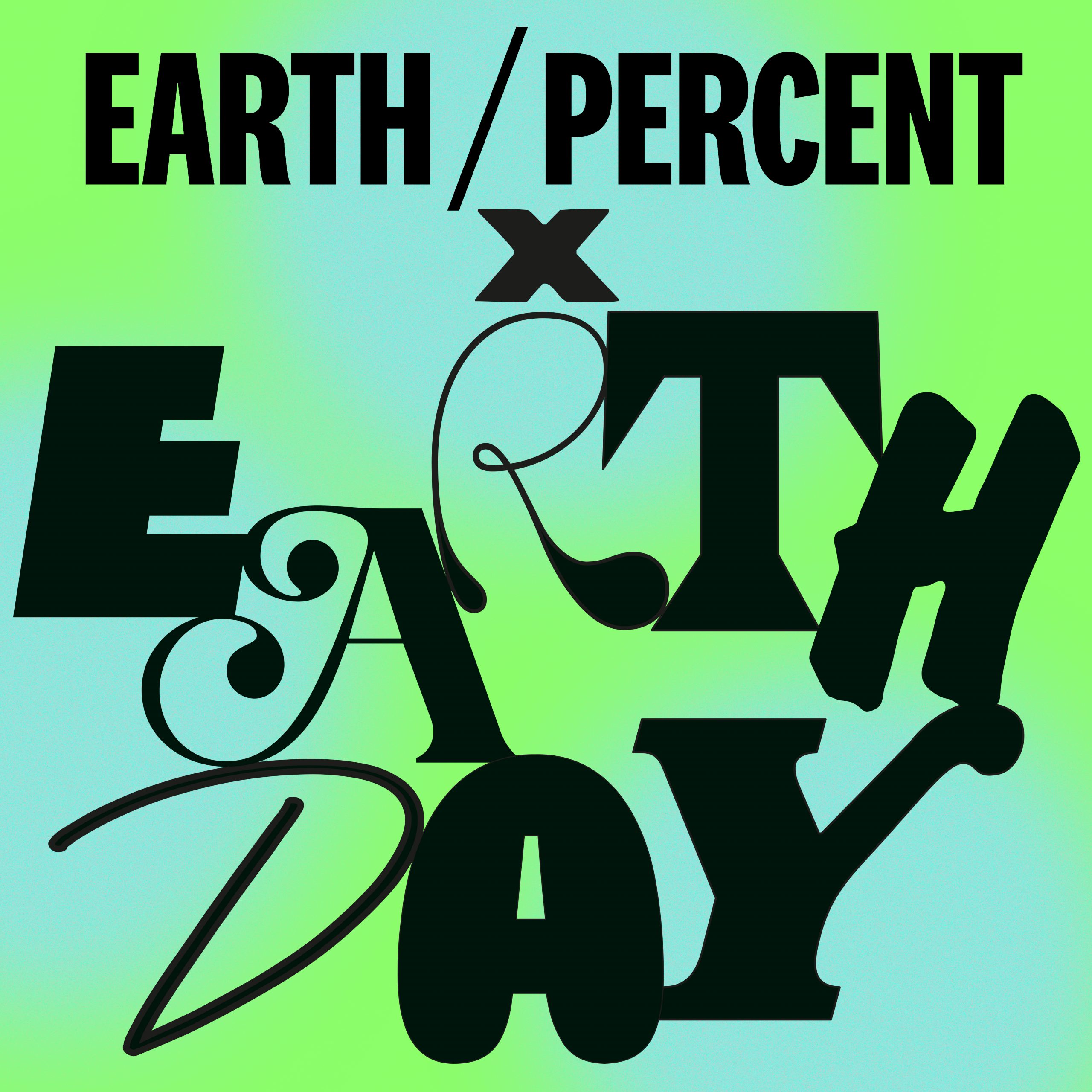
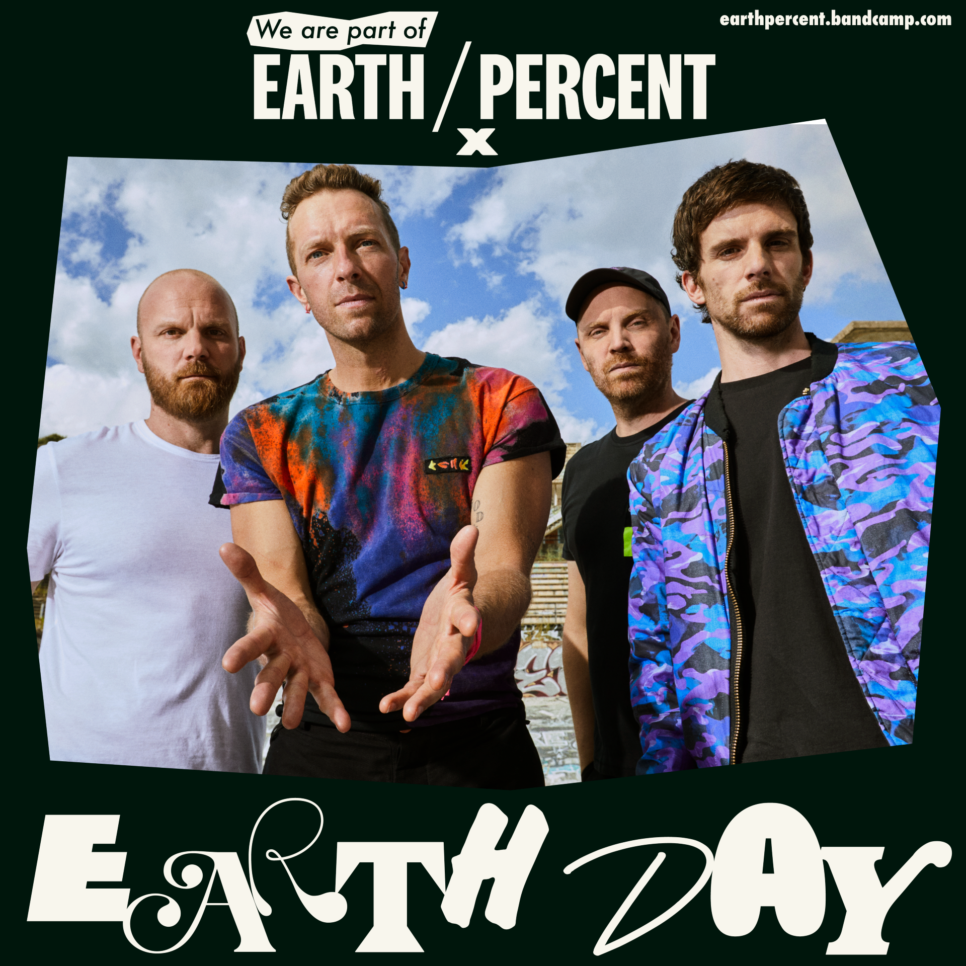
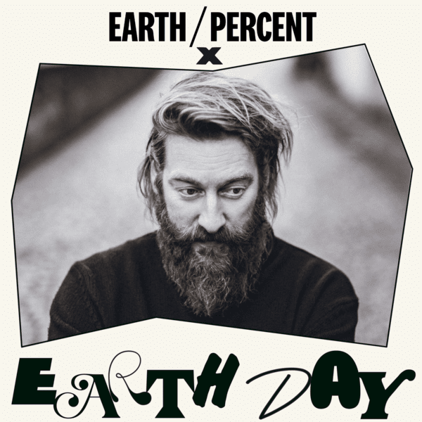
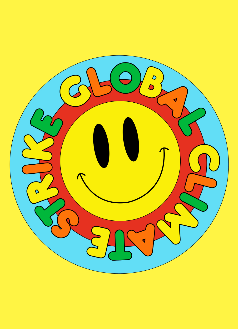
EARTH PERCENT
EARTH PERCENT CAMPAIGNS, 2022 and 2023
The incredible charity founded by Brian Eno and fave music platform Bandcamp teamed up on Earth Day to bring you a lot of green surprises. For those who don’t know, Earth Percent is a charity providing a simple way for the music industry to support the most impactful organisations addressing the climate emergency. Follow their steps and support if you can.
We were lucky enough to work on this year's and last year campaigns - throughout digital and printing assets, from billboards to banners to merch.


NEIGHBOURHOOD BOTANICALS
NEIGHBOURHOOD BOTANICALS, beauty product designs, 2021
We teamed up with amazing Neighbourhood Botanicals to create two of their products together. We love this company so much and we use their products. Neighbourhood Botanicals distinguishes itself by being a brand where every product is the brainchild of its founder, Micaela, meticulously formulated within our lab located in Leyton, east London, UK. Embracing the power of nature, all our formulas incorporate natural ingredients and prioritize the use of cold-pressed plant oils whenever feasible.
Group Font
This was a huge team effort between 37 designers from all over the world. We worked very hard in order to create a wild font that would raise money towards funds and charities. 100% of the profit have gone to Black, Lebanon, Trans funds and to Covid-19 research.
✨ Below, the donations up to date✨
£4393 to Covid-19 research via @who
$710 to The Marsha P. Johnson Institute
$710 to @campaignzero
$710 to @blackvisionscollective
$710 to @aclu_nationwide
$710 to @yourrightscamp
$400 to @lebfoodbank
$400 Lebanon Diaspora 2020 Crisis Relief Effort
$400 Food and medicine for kafala victims in Lebanon
The full list of designers is: Aaron Lowell Denton, Alec Tear, Barbara Malagoli, Ben Tipton, Benedikt Luft, Bijan Berahimi, Brandon Nickerson, Combrisi, Connor Mikita, David Strother, Dnorsen Design, Dominic Kesterton, Ethan Fender, Félicité Landrivon, Gabriel Alcala, Gabinete Exquisito, Gregory Page, Jackie Rivera, Jake Farmer, Jess Ebsworth, Mathery, Nam Huynh, Parco Studio, Polytype, Raissa Pardini, Renato Flores, Robbie Simon, Ruan Van Vliet, Sam Sheridan, Simen Royseland, Sophy Hollington, Stephen Rossi, Studio Sofa, Wedge Studios, Tamara Arkatova, Tiernan Crilley and Tim Presley. Plus web design help from FORM Digital.
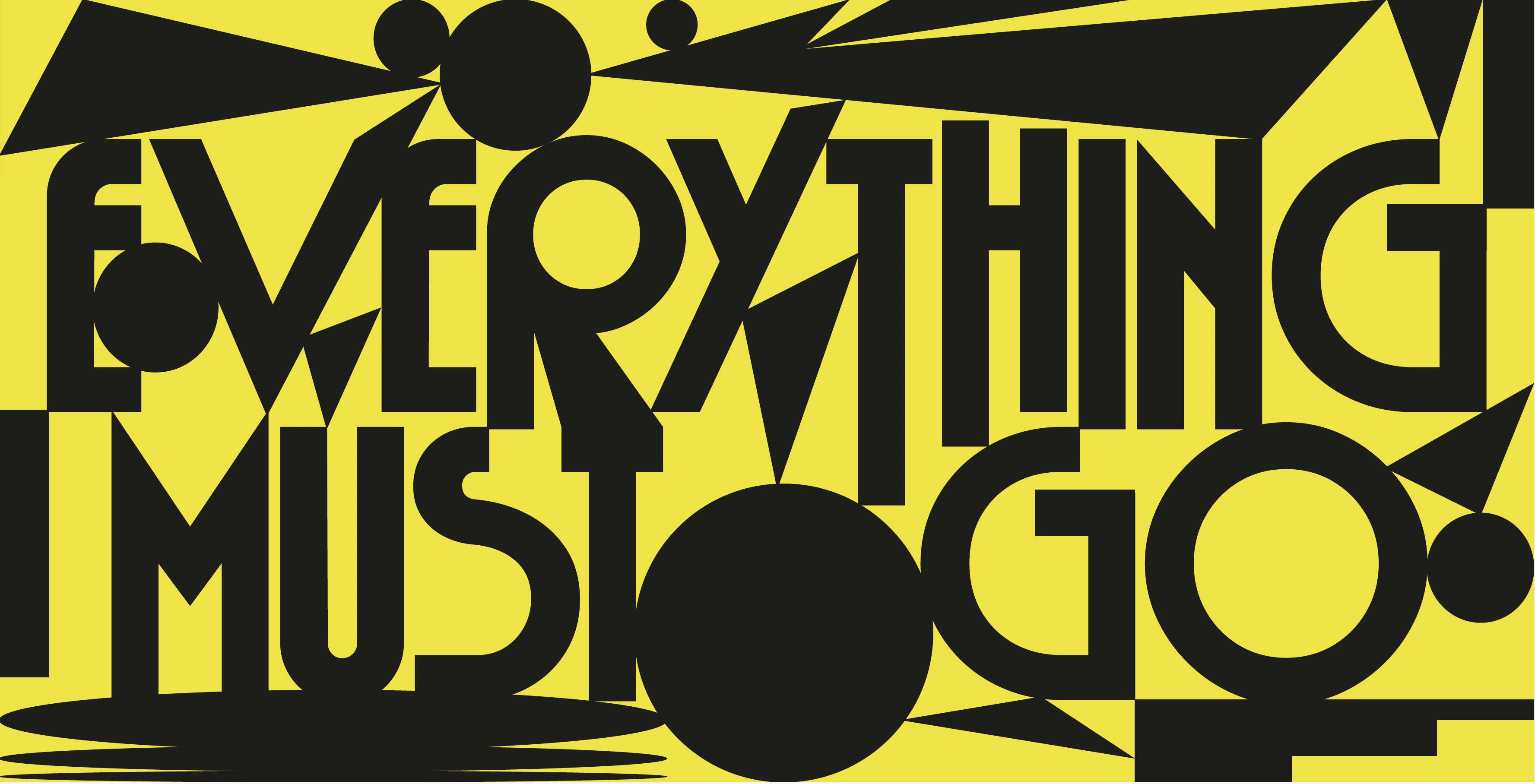
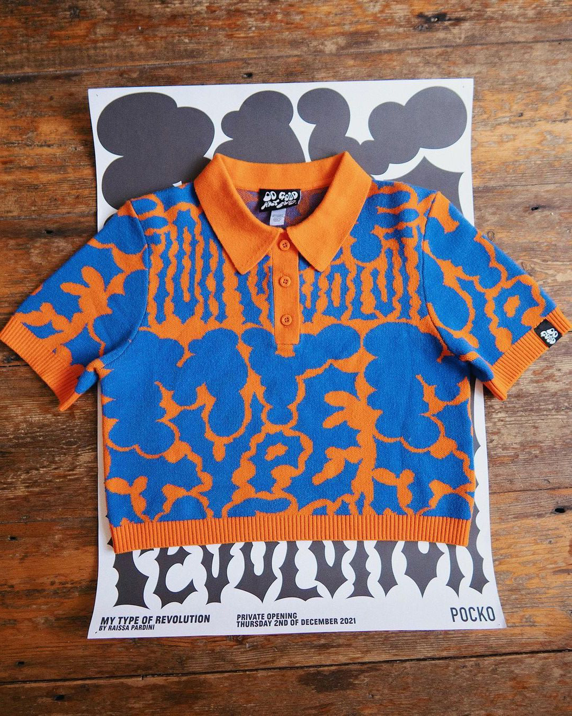
My Type Of Revolution
MY TYPE OF REVOLUTION, 2022
“My Type of Revolution” is an exhibition surrounding Raissa’s professional and personal practice. Using her skills as a creative designer, Raissa brings awareness to issues close to her heart and industry, often creating posters as forms of protest.
From climate change, to lack of diversity in the creative industry, Raissa spreads reflective messages using bold typographic statements and equally bold design. The exhibition will feature wall to wall prints and posters, with sculptural typography elements.
Students were invited to the exhibition to check a wall to wall archive of "mistakes", drafts, sketches, inspiration Raissa put together to show every single step of the process. The final assets are only the outcome of a long journey made out of fails & scrabbles, messy pieces of paper and tests.

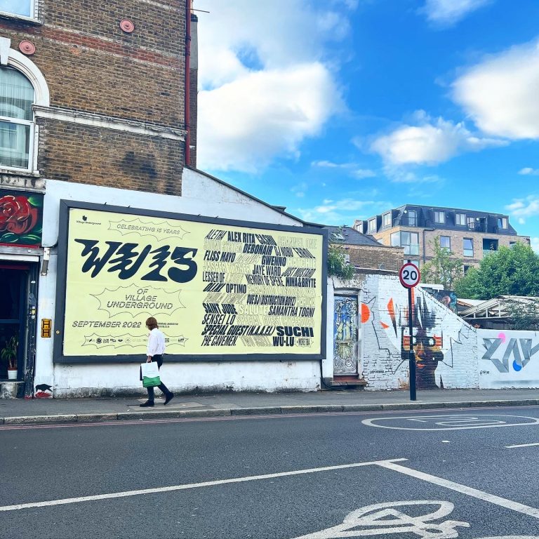
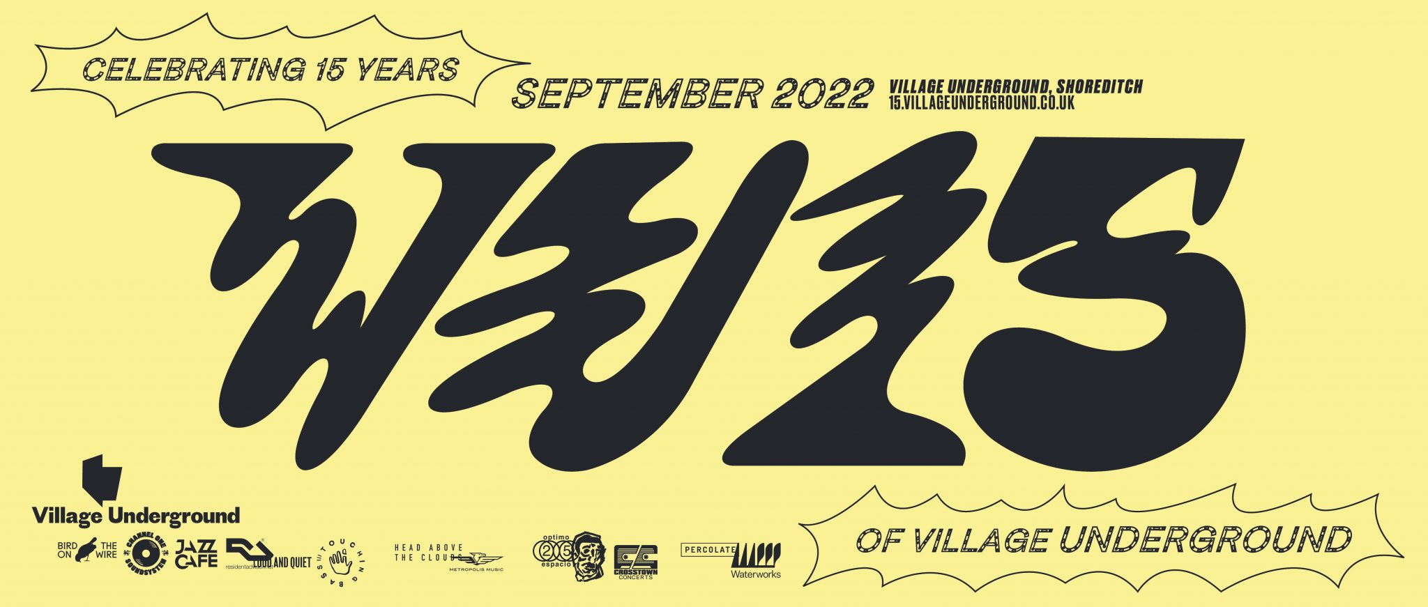
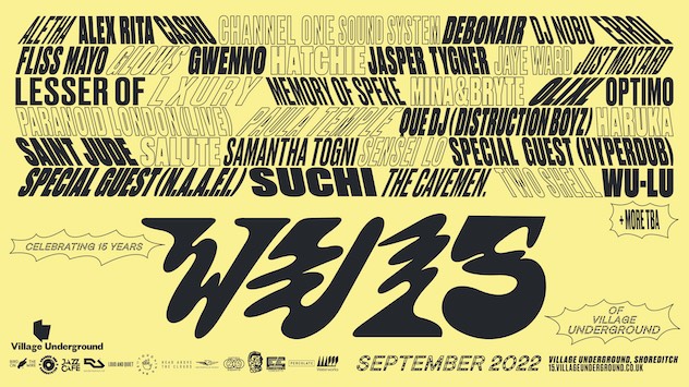
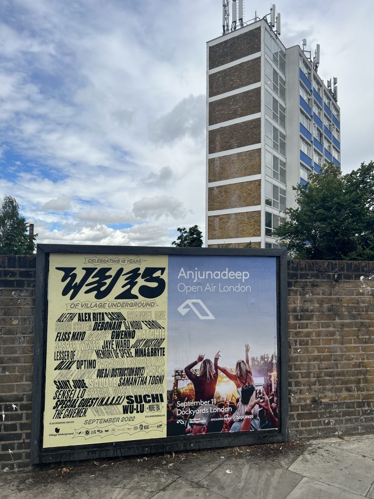
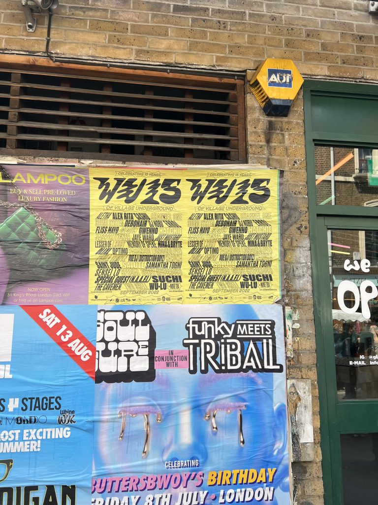
VILLAGE UNDERGROUND
VILLAGE UNDERGROUND CAMPAIGN AND REBRANDING, 2022
Village Underground (VU) is one of the most iconic venues in London. It launches many artists carrier and we had the pleasure of creating assets for its but VU15 party and rebrand the venue assets. From billboards to animations, this was an extensive print and digital campaign, close to our heart.
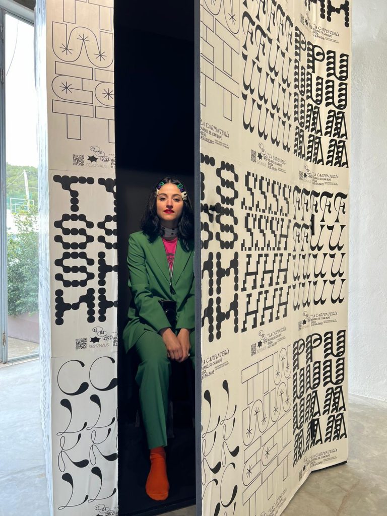
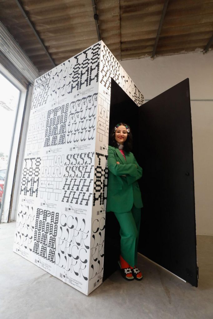
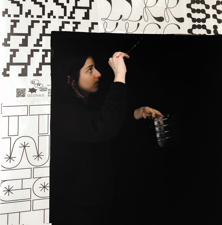
Inspiration Information, Ibiza
"Inspiration Information", Ibiza, 2022
Wood, paper, ink, glue, sound
237x126cm
Raissa: I was invited to Ibiza by curator Linda Rocco and foundation Ses12Naus in February for an art residency.
Me and another 8 international artists were invited to work on the presence of the island, exploring Ibiza and take inspiration from the frequencies and magnetism the island offers during the winter. I started thinking about the contrast between its presence in the summer - when tourism is booming - and the winter, when the island offers locals unique smells, stunning views and interesting sounds that lived there for thousands of years and will always be present in Ibiza, no matter what happens in the summer.
I spent weeks recording anything I could pick up in Ibiza. By recording the sound that organically came out of the island I produced a track with @luke_lajoya that invites people to meditate to the real presence of the Ibiza.
Once the track was done, I produced a big wooden box which I painted completely black inside and tested the sound there. I wanted people to feel very connected with the island and really isolated at the same time. Next step was covering the box and I had the idea of making posters out of some of the sound I recorded and promote them as street posters, looking like they should be from dance clubs in Ibiza.
That way I managed to promote the listening space as a club, tricking tourists and music lovers to come and enjoy the real presence of Ibiza.
Inspired by the island and its (real) sound.
Also inspired by Futurism, Russolo and ambient artists like John Cage.
MOOOOORE DESIGN!
MORE TO COME!
More design from our Creative Director Raissa is coming to this section.
From record sleeves for Maneskin, Ashe, Flamingods, Girl Ray to posters for Willie Nelson, Bikini Kill, Paolo Nutini, Paul Weller, to books for Dolly Parton, Pam Des Barres, Sex Pistols, The Four Tops and then again merchandising for Metronomy, Squid, products for start ups, packagings, printing and digital assets, campaigns for Charlotte Tilbury and Frankie Bikinis.
Having fun selecting between this extensive archive, we'll be back with this section very soon!
For any up-to-date design from raissa, please follow her Instagram page here.


